Hi all,
Welcome back to another spotlight session. I have known Gbolahan for a while now and have really admired both his growth in the community and his desire to pass that passion on to others. Today we sit down to explore how he tailored his content to help build his personal brand.
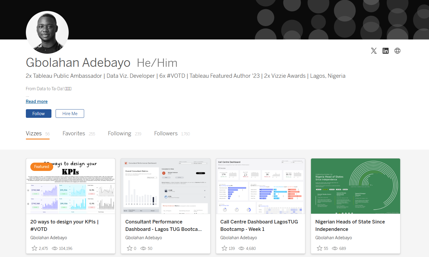
CJ: For those that are unaware, could you tell us a little about your journey to date? How did joining the community in 2022 help shape your passion for data visualization?GB: I’ve been using Tableau for a while, but it wasn’t until 2022 that I truly became part of the community, thanks to my friend Idris Akilapa. I reached out to him, eager to recreate some of the amazing visualizations I had seen on Tableau Public. We got on a call, where he explained what I needed to do and introduced me to Makeover Monday. This became my first significant project in joining the community. By participating in Makeover Monday, I got access to watching Andy Kriebel and Eva Murray discuss and create live visualizations. This motivated me to improve my consistency and start sharing my visualizations on Tableau Public, Twitter, and LinkedIn to showcase my progress. Last year, I decided to take things up a notch by pushing out even more projects. I realized the importance of developing a personal style, although initially, I was more into exploring various inspirations.This year, I focused on creating business dashboards to open up more opportunities, and I had insightful conversations with Chimdi Nwosu, who played a pivotal role. We started meeting every Sunday to discuss design and our ongoing projects. This regular exchange significantly contributed to my growth this year, helping me craft a unique style for myself.One of the most memorable milestones in my journey was winning the Notable Newbie award at the 2022 Tableau Conference. It was an incredibly affirming moment that made me realize the impact of my contributions to the Tableau community. It felt amazing to be recognized as someone who was making a difference. This year, receiving the Vizzies award for Biggest Growth was even more special. It showed me that the community continued to see my efforts and recognized my evolution as I worked towards developing a personal style. It’s been an incredible journey, and these awards have only fueled my passion further.CJ: Over time individuals tend to find their “thing” within the data visualisation space. I often associate with you, really clean design, particularly when it comes to business dashboards. How important is this as part of your personal brand? Is this something you proactively worked towards?
GB: Yes, CJ, this is an important part of my brand, and like I said, I took it upon myself this year to create a style. Last year, if you remember, you and I had a discussion after I won the Notable Newbie Award about how I could move on in my career and in my visualization as well.
I felt that the Notable Newbie was an award to recognize those that are new to the community, and after you win such an award, you have to think about the next steps to elevate your game.
You said to me, “It’s just good to find your niche. Choose a particular part of the community where you feel like you excel and deep dive into it.”
I had some deep thoughts about what part of the field I liked the most, and I remembered from the very start that I wanted to highlight the amazing designs of others, particularly the design work of Chimdi Nwosu.
So, I reached out to Chimdi, talked to him about what I was thinking, and told him that I would like to get inspired by some of his processes and what he does. He asked if I would be down to meet once a week to discuss design and the projects he was working on. Through this exchange of ideas, I aimed to improve my work and build my own style.
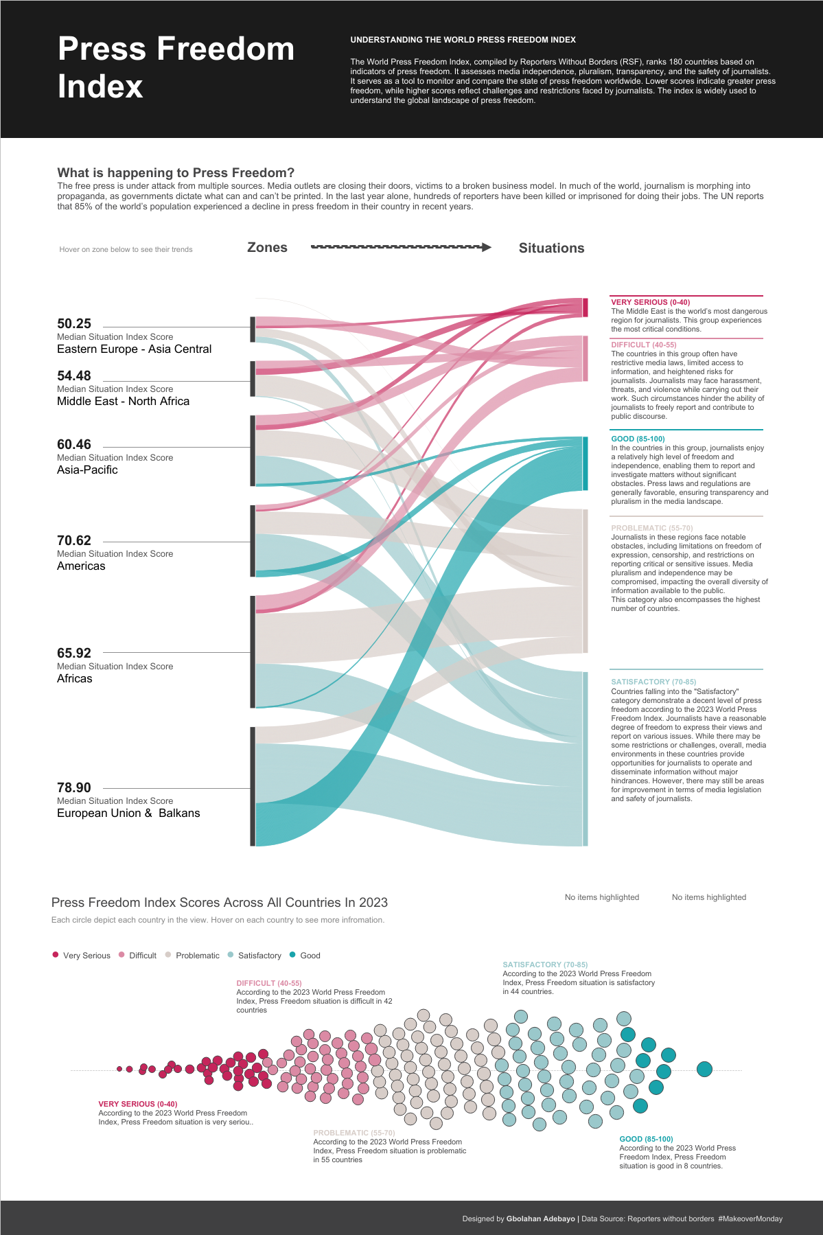
We started this initiative, and I began to observe how he approached various tasks. I would create visualizations, share them with him, and he would critique my work, providing feedback and suggestions for improvement. One particular dashboard where I really felt his impact was the Press Freedom dashboard, which went on to be shortlisted for the Information is Beautiful Awards. I created an initial idea, sent it to him, and he strongly suggested improvements, even showing me a prototype of what the final result should look like in terms of colors, design, text placements, and formatting.
After this experience, I realized how much I had to improve. He also shared how to use Pinterest for inspiration, encouraging me to follow design ideas closely.
My first dashboard towards discovering this new style was my Doctor Appointment dashboard, a collaboration with a friend in the community, Israel Ayola. With this dashboard, I aimed to create something with a nuanced design, looking really clean and conveying a web UI feel.
While working on it, I posted it midway, and Chimdi noticed. He asked why I had shared it unfinished and encouraged me to complete it. We finished it, and it received very positive feedback from the community.
After this project, I felt like I had found my style, so I started gathering inspirations on Pinterest every day. I intentionally visit Pinterest to collect ideas for my dashboards. Continuous practice, trying out new business projects, and the advent of Chargeability allowed me to create datasets and explore various dashboard types, all contributing to my journey of building a personal brand that focuses heavily on design and UI in business dashboards.
So yes, definitely, this is something I’ve proactively worked towards.CJ: How has working as a freelancer, consultant and contractor played a part in understanding how different companies utilize dashboards and the requirements behind creating a business dashboard?GB: Working as a freelancer, consultant, and contractor has significantly broadened my experience, especially in understanding how companies want to utilize dashboards compared to creating them for my portfolio. I’ve learned that in a business environment, it’s not just about showcasing what you want, but about delivering what needs to be seen. Working as a Tableau consultant for large companies has shown me the importance of making sure that even the most basic elements are understood before advancing. It’s a rigorous process, starting from gathering and understanding requirements, ensuring the design’s usability, to testing, gathering feedback, and iterating to meet stakeholders’ needs. As a freelancer, working on diverse projects has given me confidence in adapting to various requirements and providing tailored solutions. In conclusion, my experiences across freelancing, consulting, contracting, and full-time roles as a Data Visualization Developer have shown me that while building business dashboards can be challenging, they are crucial for reporting accurately and provoking insights. The goal is to create dashboards that prompt stakeholders to ask questions and delve deeper into the data, driving informed decision-making. I’ve come to appreciate the intricacies of this process and its importance in the business world.CJ: I’d like to jump into some of the technical behind your business dashboards, from your Tableau Public profile.CJ: Your startup funding dashboard is wonderful in typography, white space and padding.You opted to go for titles for each chart that pose as questions. What was the choice behind answering definitive questions? How do you strike the balance for dashboards answering specific questions vs being explorative?GB: My Startup Funding dashboard was created during my interview process for my current role. The idea was to showcase my skills in the context of startup funding. I found inspiration in the revenue dashboard by Pradeep Kumar from the Tableau Public community. This dashboard was meant to demonstrate my approach to unfamiliar datasets and industries, showcasing how I navigate and visualize data. I focused on showcasing relevant KPIs, conducting research on the types of questions stakeholders in the startup funding industry might ask. This informed the KPIs I included and how I structured them by quarter to provide a comprehensive view. I used a left-sided navigation bar for easy access to different views and included features like highlighting specific months in trend graphs for user interactivity. To frame the charts, I chose a question-based style to provoke stakeholders to engage with the data, guiding them to answers while encouraging further exploration. This approach helped me focus on specific data points I wanted to highlight, making the dashboard informative even with my limited familiarity with the dataset. As for whitespace, padding, and typography, I was inspired by Pradeep Kumar’s work. I learned the importance of ample padding, whitespace, and clear typography for readability and visual hierarchy. These elements were crucial in making the dashboard legible and allowing users to follow the data story effectively. Striking a balance between answering specific questions and being explorative depends on my familiarity with the dataset. In this case, I focused on specific questions due to my limited knowledge of the industry, aiming to demonstrate thorough research. With more familiarity, I would incorporate more explorative elements to connect different data points and provide deeper insights.CJ: Dashboards such as the Doctor Appointment dashboard bring with it a modern, website-like feel to the reporting. The booking / landing page style compliments the appointment theme. What thoughts go into designing the dashboards with “themes”?GB: When I first start building dashboards, I try to imagine what it is I'm going to want to build. Then, the most important thing I think about, before even deciding what's next, is to look for inspiration. I'm someone who constantly thrives on inspiration and wants to see what others have done, either in the data space or the UI/UX space. I explore these dashboards on platforms like Pinterest, Dribbble, and Behance to find my next source of inspiration.Once I find a dashboard that inspires me, I choose the industry I want to apply this style to. In terms of design, I consider the theme of the dashboard in a way that fits the concept of what it's about, especially for business dashboards.For example, with the doctor appointment dashboard, I felt that focusing on user interaction and minimizing native features to give it a modern website-like feel would suit a doctor use case. Doctors typically don't have a lot of time for extensive dropdowns, so buttons that help them quickly achieve their goals are ideal. I consider who the dashboard is targeting and how the end-product user will perceive it. The inspiration I draw from, the intended user, and my vision of the final result all play crucial roles in designing dashboards with themes.CJ: Some of your dashboards vary in terms of layout with filters and headers, left, right or at the top in the case of your marketing campaign visual. Do you think there are cases where one takes precedence over another in terms of visual hierarchy?
GB: Yes, definitely. I think there are cases where one takes precedence over another in terms of visual hierarchy, and here's my approach to it. I approach it in terms of three things:
Firstly, based on choice. Sometimes, I choose to have filters or navigation panes at the top, left, or right, based on the inspirations I work with. If I see something inspiring with a unique layout, I might incorporate that into my design purely by choice.
Secondly, the number of pages in the dashboard. If my dashboard has more than three pages, I tend to use a left-sided navigation pane to provide enough space to stack all the pages and allow easy navigation. If there are three or fewer pages, a top navigation pane can work well to show the switch between pages clearly.
Thirdly, the number of filters. For dashboards with many filters, I might use a left or right navigation that floats in the filters when selected or a top navigation that floats them from the top. It depends on what suits the layout and user experience best.
So, when building a dashboard and determining what should take precedence in terms of layouts and filters, I consider these three factors: the number of pages, the number of filters, and choice or inspiration. This approach helps ensure that the final product is not only visually appealing but also functional and user-friendly.
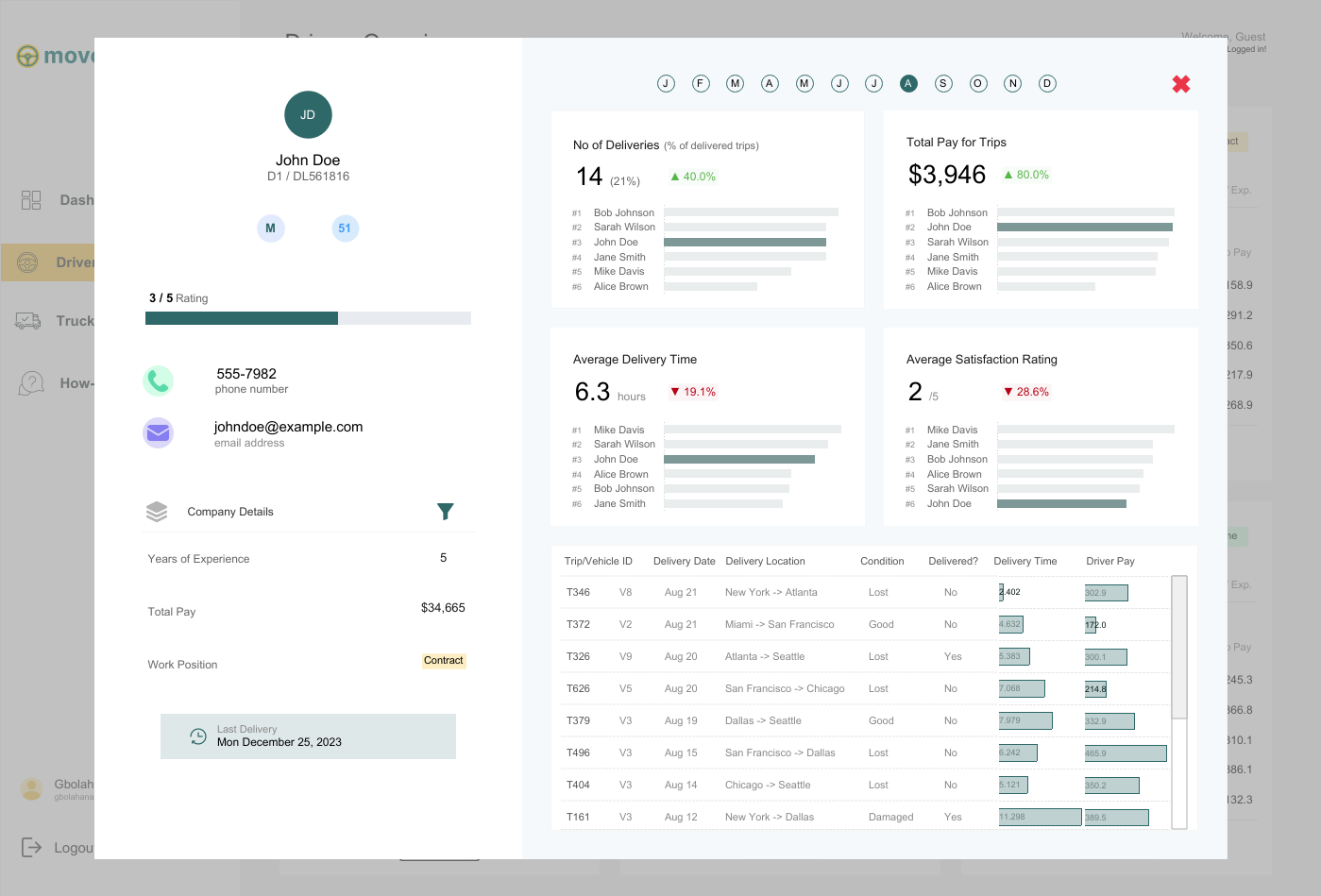
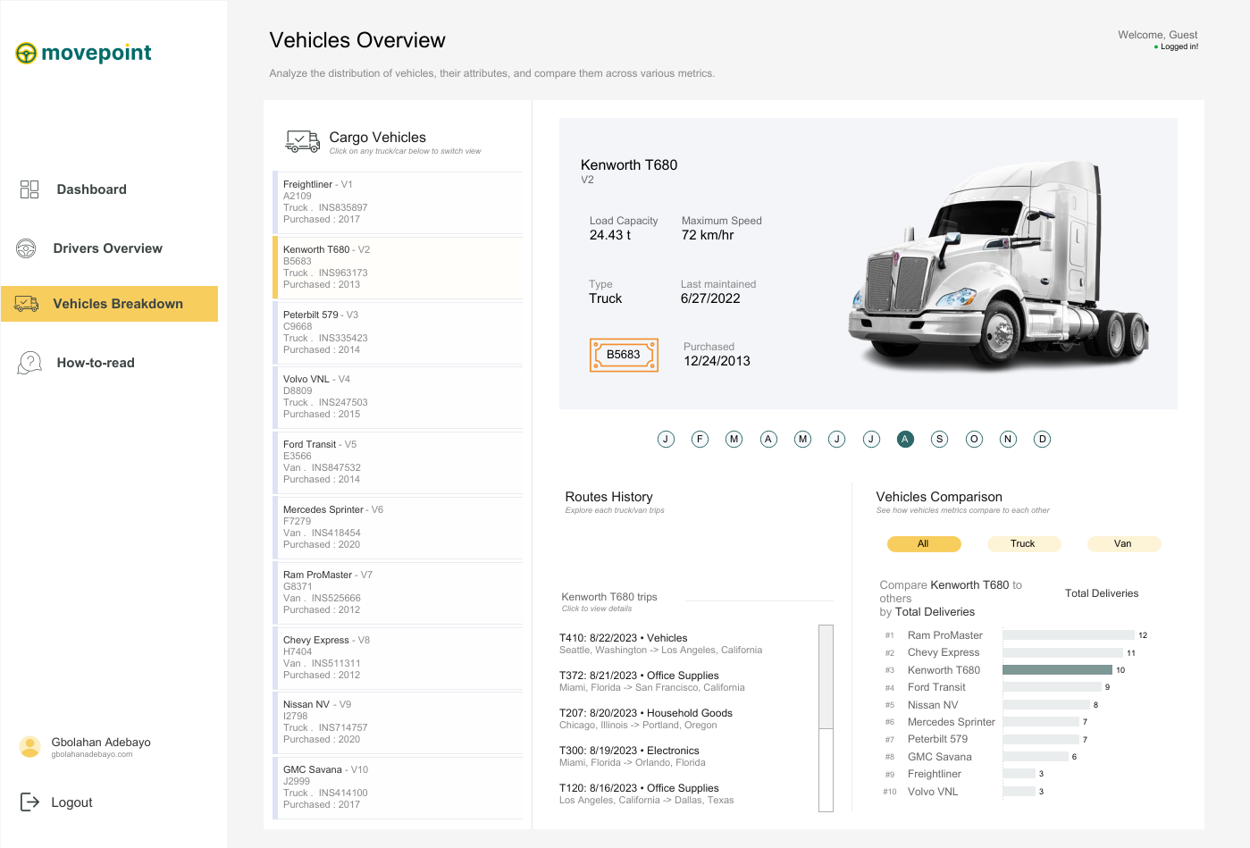
CJ: Your logistics and shipments dashboard is one of your best to date. From a design perspective what are you most pleased about? What subtle design techniques do you think help particularly elevate the visual?
GB: I absolutely love my logistics and shipment dashboard because it's one of the dashboards I've enjoyed building the most. I had so much fun with it and drew inspiration from various dashboards, bringing everything together into one cohesive design.
The first source of inspiration came from a restaurant calculator that compared different customers. I loved the breakout view and thought it would work perfectly for any industry needing to compare multiple clients or customers, allowing for an expanded view of individual performance. The expanded view was inspired by another dashboard that broke down a customer agent's activities over a year, which I felt suited the expanded view when a driver is selected.
The second page drew inspiration from a transportation business dashboard comparing trucks and vans, where selecting a vehicle switches the displayed information and image. After gathering inspiration from about four to five different dashboards, I set out to build my logistics and shipment dashboard.
From a design perspective, this is my best work because I had a clear goal and was able to achieve it, even though it took time to create dynamic zone visibility for each driver. Subtle design techniques, like maintaining good white space to display a lot of information on a single page and ensuring visible call-to-action buttons, like 'Click here to see the full driver's information,' elevate the visual experience. I also applied the golden ratio rule for color selection, making sure my call-to-action buttons had the deepest color to immediately draw attention.
Finally, the vehicle breakdown page stands out with a scrollable interface inspired by Chimdi's email views. It allows users to click on each vehicle to see its picture, license plate, and other information, along with comparisons to other trucks or vans. All these elements together make this dashboard my favorite from a design perspective.
CJ: Your dashboards often come with a range of interactivity, be it parameter changes, filter views or navigation. What techniques do you use to help the user understand the difference? What are some of your favorite call to action design styles?Absolutely! I love incorporating interactivity into my dashboards, as it enhances their power and depth of insights beyond initial impressions. For interactivity, I leverage features like parameters (through dropdowns or parameter actions), filter views, navigation, and especially dynamic zone visibility, which is a favorite of mine in Tableau.To help users differentiate between these interactive features, I maintain consistent iconography and text hierarchy. Familiar icons, like a funnel for filters or arrows for navigation, make it easier for users to understand their functions at a glance. I also employ color and contrast to distinguish interactive elements, using softer tones for filters and bolder colors for navigation buttons. Tooltips and instructive callouts further guide users, explaining actions when hovered over, enhancing their understanding of dashboard interactivity.As for my favorite call-to-action design styles, I enjoy using sleek, rounded buttons that emulate a web app feel, guided walkthroughs with clickable hints or step-by-step guides, and straightforward instructional text like “click here to filter” or “select to change the view,” ensuring users grasp each interactive element’s purpose without disrupting the flow.CJ: Your design style has slowly changed in color palette to use more toned down colors, only tending to use 3-4 colors at a time on a page - with maybe one striking bold color. How has your knowledge of color utilization changed over the past year?
GB: Over the past year, I’ve tried to really grow in terms of design, and there’s definitely no design without appropriate color usage.
My understanding of color has evolved from working with a lot of inspirations. I’ve observed that many of these sources already have a strong grasp of color usage, often following the principle of having one bold color paired with two to three undertones. I feel this approach is especially important for business dashboards, as a consistent color theme can often relate to company branding or personal portfolio branding.
Generally, my understanding of color has grown to focus more on functionality. I think about how each color supports the story, and I find that limiting the palette to three to four colors helps reduce clutter and guides the user’s focus on the most important insights without feeling overwhelmed. Bold colors are particularly useful because they can highlight key metrics or call-to-action elements, so I make sure to reserve bold colors for the most critical parts of the data.
In terms of accessibility, I’ve also put effort into understanding color contrast and standards. I regularly read articles or watch videos on these topics, and, most importantly, I learn from the work of others. I go through many dashboards to see how colors are matched, and I think it’s been a valuable blend of insights.
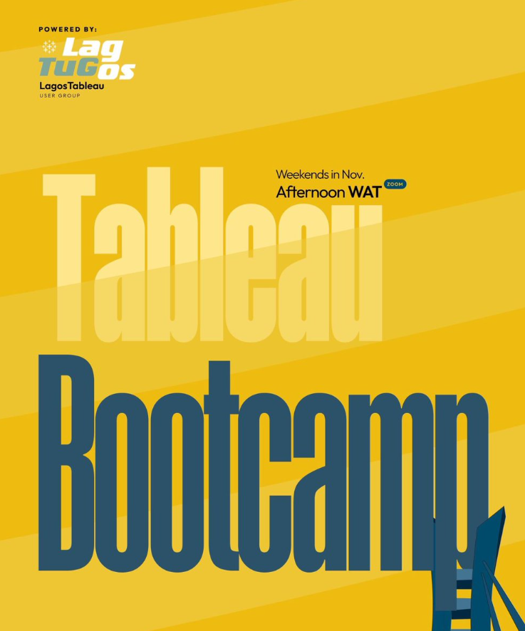
CJ: I really admire the amount of effort you’ve put into paying it forward with leading the Lagos TUG. What prompted you to get involved? How have the sessions been going, and what do people have to look forward to in the coming months?Thank you, CJ, for appreciating the work the Lagos TUG has been putting back into the community. Getting involved felt natural because, for myself—and I’m sure for others in the Nigerian community—there’s always been a strong desire to have a vibrant Tableau user group right in the heart of Nigeria’s tech space, which is Lagos. We wanted one that’s active and impactful. Abisola Oni, a Tableau Visionary, did an amazing job in the lead-up to the official launch of the Lagos TUG. Let me emphasize “official,” because it has existed before us, and Abisola put in significant work to bring people together to learn Tableau, visualize data, build portfolios, and refine their work. Big kudos to her for that.However, we felt the need for a group that could be even more active and easily recognizable, with a dedicated page and a central hub where community activities are accessible. This vision birthed the Lagos TUG. The original idea didn’t come from me but from Omokehinde Ayodeji, who reached out and shared the concept of building this community together as co-leads. We also brought on two incredible co-leads, Maureen and Idris. We held initial meetings, discussed our vision, and since then, many community members have been incredibly supportive by joining the team. I think anyone who has benefited from the community naturally wants to give back, completing the cycle of learning and sharing—receiving and then giving.What prompted me to get involved was precisely that: the opportunity to give back. I received so much support from amazing people as I was growing in Tableau, learning the platform, and advancing my skills. I believe it’s invaluable for new members to find a strong community of their own, especially here in Nigeria, where you might not see many people in your immediate environment using Tableau. Having a familiar space, where you can connect with others right here, is empowering. Seeing others use Tableau to achieve great things, get jobs, and create opportunities is exactly why I wanted to be involved. When you join an exceptional community, you can build your skills, grow, and realize that the sky is truly the limit.In terms of the sessions, we’ve held three virtual ones so far, and we’re planning our first in-person session at the end of November. The sessions have been incredible. We’ve divided our tasks, and Maureen has done an amazing job reaching out to speakers for our events. We’ve aimed to cover a broad spectrum of topics related to Tableau—Tableau Prep, Tableau Desktop, Tableau Cloud—and even larger themes like design, color usage, and general visualization and data modeling concepts. The sessions have been fantastic, with excellent speakers and good turnout. People are genuinely excited to join our community, contribute insights, and speak, which has been incredibly helpful.As for what people have to look forward to in the coming months, we’re working on a boot camp this November focused on live dashboard building. Community members will be able to follow along, create these dashboards for their portfolios, and gain hands-on experience—not just with theoretical concepts but also practical application. They’ll learn how to use different aspects of Tableau to build business dashboards and creative visualizations. Next year, we have even more exciting sessions planned, and our upcoming physical session promises to be a memorable event. So, there’s a lot to look forward to!CJ: Is there anyone in the community that has particularly impacted your journey from a technical and design perspective? What was it about their work that you admired?
GB: Yes, definitely. There have been people in the community who have significantly impacted my journey from various perspectives. Honestly, it’s possible I might miss a few names because there’s so much value in the data viz community. You literally learn from everyone, whether actively or passively. Just being on Tableau Public every day allows you to learn from so many people—from how they design their dashboards, the choices they make in visualizing data, to the articles they write and the videos they share. Everyone inspires me in some way and has had an impact on me.
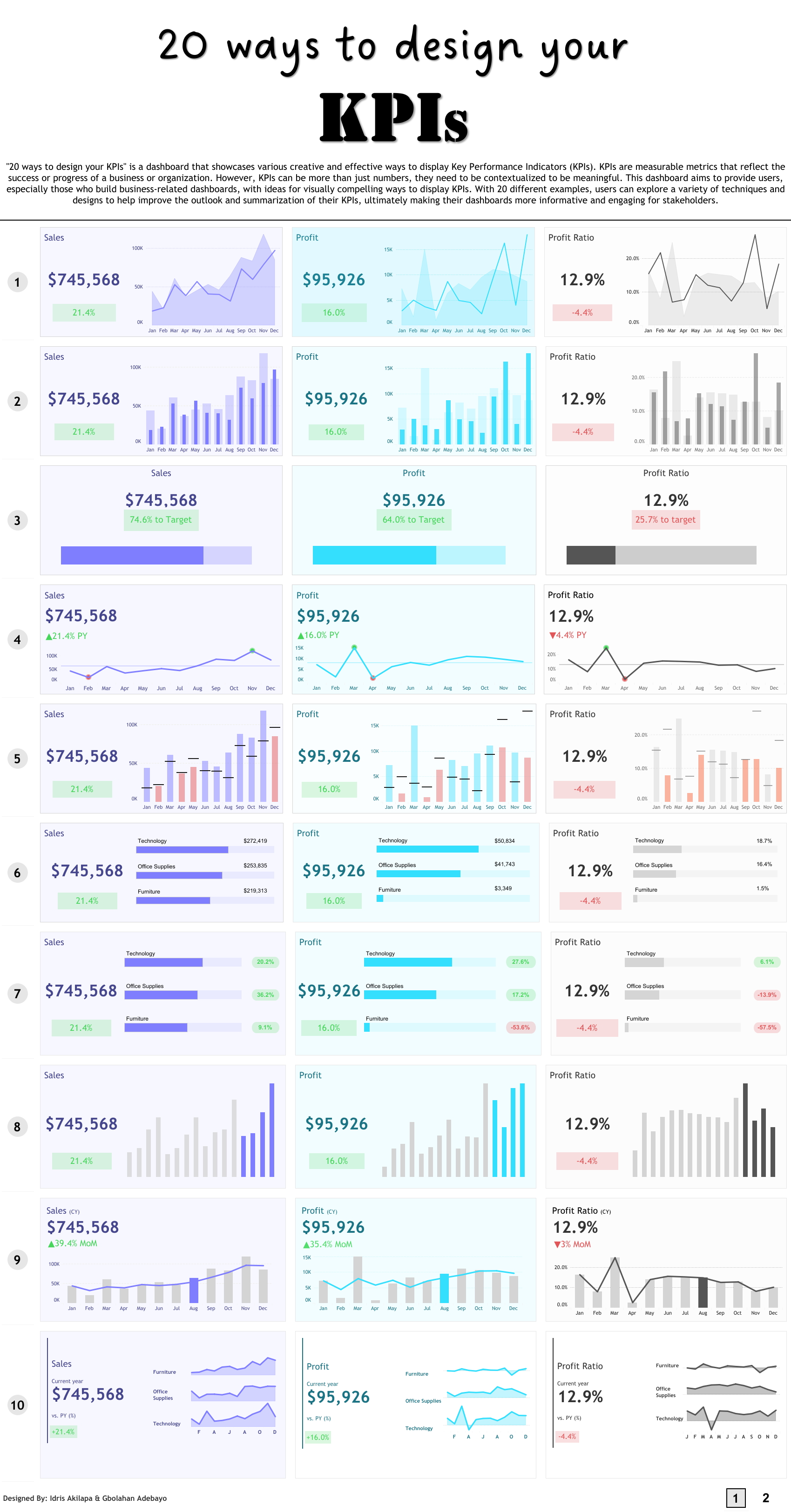
If I were to mention a few individuals specifically, one would definitely be Idris Akilapa. He was the first person I reached out to when I was starting, and he was incredibly supportive. He helped me understand how to connect with the community, feel comfortable sharing my work publicly, ask questions, and sometimes even land gigs. We also worked together on the “20 Ways to Build KPIs” project, which was an incredible experience and has become one of the most viewed dashboards on Tableau Public, with over one hundred thousand views—an amazing accomplishment.
Another person is Chimdi Nwosu. Chimdi has been pivotal, especially from a design perspective. His visualizations were the first ones I saw on Tableau Public that truly inspired me to step up my design skills and think more deeply about how I present information.
In terms of design, Chimdi has been particularly supportive. Earlier this year, we decided to set up a weekly Sunday meeting where we’d spend an hour discussing design, any questions I had, and the projects I was working on at the time. We’d share ideas, talk about the best ways to approach certain challenges, and work through technical or calculation issues. Chimdi’s been a huge help, both creatively and technically.
My good friend Michael Fajemilehin has also been an incredible resource, especially on the technical side. He’s very skilled with Tableau calculations, and we often bounce ideas off each other whenever I’m working on something complex. He’s been instrumental in my journey from a technical perspective.
Then there are others like Zainab Ayodimeji and Abisola Oni, along with other talented Tableau people in Nigeria. Seeing what they can accomplish from here has been a huge motivation, reminding me that I can push my limits too.
On a broader scale, I’m a big fan of Judit Becker’s work. I love seeing how her ideas come to life in Tableau; she’s truly inspiring. And of course, CJ, you’ve been a huge influence as well. From the start, we’ve had meaningful conversations that go beyond just technical or design advice. We’ve discussed the data visualization field and Tableau community as a whole, shaping my perspective on what to pursue next. I remember the incredible advice you gave me after the Vizzes award for Notable Newbie—it really shaped my direction after that.
There are so many others, like Andy Kriebel, Flerlage Twins, Adedamola Ladipo and Sarah Barlett. I could probably keep listing names all day. Each of these amazing people has been incredibly helpful in different ways—Chimdi for his design insights, Idris for showing me what’s possible here, and you, CJ, for your guidance and constant willingness to offer advice. This community has been a huge part of my journey, and I’m grateful to everyone who’s played a role.
LOGGING OFF,
CJ
 GB: I’ve been using Tableau for a while, but it wasn’t until 2022 that I truly became part of the community, thanks to my friend Idris Akilapa. I reached out to him, eager to recreate some of the amazing visualizations I had seen on Tableau Public. We got on a call, where he explained what I needed to do and introduced me to Makeover Monday. This became my first significant project in joining the community.
By participating in Makeover Monday, I got access to watching Andy Kriebel and Eva Murray discuss and create live visualizations. This motivated me to improve my consistency and start sharing my visualizations on Tableau Public, Twitter, and LinkedIn to showcase my progress. Last year, I decided to take things up a notch by pushing out even more projects. I realized the importance of developing a personal style, although initially, I was more into exploring various inspirations.
This year, I focused on creating business dashboards to open up more opportunities, and I had insightful conversations with Chimdi Nwosu, who played a pivotal role. We started meeting every Sunday to discuss design and our ongoing projects. This regular exchange significantly contributed to my growth this year, helping me craft a unique style for myself.
One of the most memorable milestones in my journey was winning the Notable Newbie award at the 2022 Tableau Conference. It was an incredibly affirming moment that made me realize the impact of my contributions to the Tableau community. It felt amazing to be recognized as someone who was making a difference. This year, receiving the Vizzies award for Biggest Growth was even more special. It showed me that the community continued to see my efforts and recognized my evolution as I worked towards developing a personal style. It’s been an incredible journey, and these awards have only fueled my passion further.
CJ: Over time individuals tend to find their “thing” within the data visualisation space. I often associate with you, really clean design, particularly when it comes to business dashboards. How important is this as part of your personal brand? Is this something you proactively worked towards?
GB: I’ve been using Tableau for a while, but it wasn’t until 2022 that I truly became part of the community, thanks to my friend Idris Akilapa. I reached out to him, eager to recreate some of the amazing visualizations I had seen on Tableau Public. We got on a call, where he explained what I needed to do and introduced me to Makeover Monday. This became my first significant project in joining the community.
By participating in Makeover Monday, I got access to watching Andy Kriebel and Eva Murray discuss and create live visualizations. This motivated me to improve my consistency and start sharing my visualizations on Tableau Public, Twitter, and LinkedIn to showcase my progress. Last year, I decided to take things up a notch by pushing out even more projects. I realized the importance of developing a personal style, although initially, I was more into exploring various inspirations.
This year, I focused on creating business dashboards to open up more opportunities, and I had insightful conversations with Chimdi Nwosu, who played a pivotal role. We started meeting every Sunday to discuss design and our ongoing projects. This regular exchange significantly contributed to my growth this year, helping me craft a unique style for myself.
One of the most memorable milestones in my journey was winning the Notable Newbie award at the 2022 Tableau Conference. It was an incredibly affirming moment that made me realize the impact of my contributions to the Tableau community. It felt amazing to be recognized as someone who was making a difference. This year, receiving the Vizzies award for Biggest Growth was even more special. It showed me that the community continued to see my efforts and recognized my evolution as I worked towards developing a personal style. It’s been an incredible journey, and these awards have only fueled my passion further.
CJ: Over time individuals tend to find their “thing” within the data visualisation space. I often associate with you, really clean design, particularly when it comes to business dashboards. How important is this as part of your personal brand? Is this something you proactively worked towards?
 GB: Yes, CJ, this is an important part of my brand, and like I said, I took it upon myself this year to create a style. Last year, if you remember, you and I had a discussion after I won the Notable Newbie Award about how I could move on in my career and in my visualization as well.
I felt that the Notable Newbie was an award to recognize those that are new to the community, and after you win such an award, you have to think about the next steps to elevate your game.
You said to me, “It’s just good to find your niche. Choose a particular part of the community where you feel like you excel and deep dive into it.”
I had some deep thoughts about what part of the field I liked the most, and I remembered from the very start that I wanted to highlight the amazing designs of others, particularly the design work of Chimdi Nwosu.
So, I reached out to Chimdi, talked to him about what I was thinking, and told him that I would like to get inspired by some of his processes and what he does. He asked if I would be down to meet once a week to discuss design and the projects he was working on. Through this exchange of ideas, I aimed to improve my work and build my own style.
We started this initiative, and I began to observe how he approached various tasks. I would create visualizations, share them with him, and he would critique my work, providing feedback and suggestions for improvement. One particular dashboard where I really felt his impact was the Press Freedom dashboard, which went on to be shortlisted for the Information is Beautiful Awards. I created an initial idea, sent it to him, and he strongly suggested improvements, even showing me a prototype of what the final result should look like in terms of colors, design, text placements, and formatting.
GB: Yes, CJ, this is an important part of my brand, and like I said, I took it upon myself this year to create a style. Last year, if you remember, you and I had a discussion after I won the Notable Newbie Award about how I could move on in my career and in my visualization as well.
I felt that the Notable Newbie was an award to recognize those that are new to the community, and after you win such an award, you have to think about the next steps to elevate your game.
You said to me, “It’s just good to find your niche. Choose a particular part of the community where you feel like you excel and deep dive into it.”
I had some deep thoughts about what part of the field I liked the most, and I remembered from the very start that I wanted to highlight the amazing designs of others, particularly the design work of Chimdi Nwosu.
So, I reached out to Chimdi, talked to him about what I was thinking, and told him that I would like to get inspired by some of his processes and what he does. He asked if I would be down to meet once a week to discuss design and the projects he was working on. Through this exchange of ideas, I aimed to improve my work and build my own style.
We started this initiative, and I began to observe how he approached various tasks. I would create visualizations, share them with him, and he would critique my work, providing feedback and suggestions for improvement. One particular dashboard where I really felt his impact was the Press Freedom dashboard, which went on to be shortlisted for the Information is Beautiful Awards. I created an initial idea, sent it to him, and he strongly suggested improvements, even showing me a prototype of what the final result should look like in terms of colors, design, text placements, and formatting.
 After this experience, I realized how much I had to improve. He also shared how to use Pinterest for inspiration, encouraging me to follow design ideas closely.
My first dashboard towards discovering this new style was my Doctor Appointment dashboard, a collaboration with a friend in the community, Israel Ayola. With this dashboard, I aimed to create something with a nuanced design, looking really clean and conveying a web UI feel.
After this experience, I realized how much I had to improve. He also shared how to use Pinterest for inspiration, encouraging me to follow design ideas closely.
My first dashboard towards discovering this new style was my Doctor Appointment dashboard, a collaboration with a friend in the community, Israel Ayola. With this dashboard, I aimed to create something with a nuanced design, looking really clean and conveying a web UI feel.
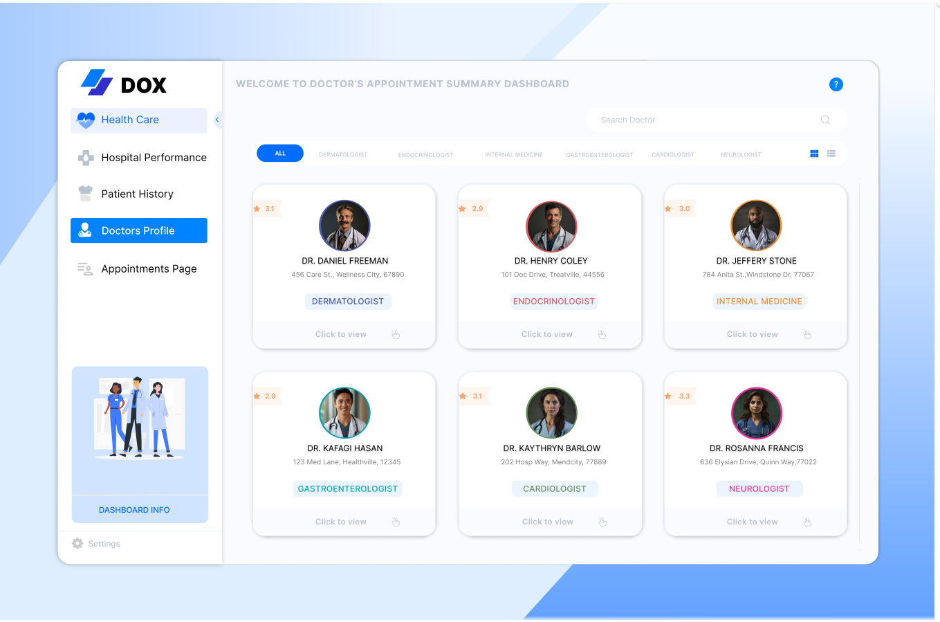 While working on it, I posted it midway, and Chimdi noticed. He asked why I had shared it unfinished and encouraged me to complete it. We finished it, and it received very positive feedback from the community.
After this project, I felt like I had found my style, so I started gathering inspirations on Pinterest every day. I intentionally visit Pinterest to collect ideas for my dashboards. Continuous practice, trying out new business projects, and the advent of Chargeability allowed me to create datasets and explore various dashboard types, all contributing to my journey of building a personal brand that focuses heavily on design and UI in business dashboards.
So yes, definitely, this is something I’ve proactively worked towards.
CJ: How has working as a freelancer, consultant and contractor played a part in understanding how different companies utilize dashboards and the requirements behind creating a business dashboard?
GB: Working as a freelancer, consultant, and contractor has significantly broadened my experience, especially in understanding how companies want to utilize dashboards compared to creating them for my portfolio. I’ve learned that in a business environment, it’s not just about showcasing what you want, but about delivering what needs to be seen.
Working as a Tableau consultant for large companies has shown me the importance of making sure that even the most basic elements are understood before advancing. It’s a rigorous process, starting from gathering and understanding requirements, ensuring the design’s usability, to testing, gathering feedback, and iterating to meet stakeholders’ needs.
As a freelancer, working on diverse projects has given me confidence in adapting to various requirements and providing tailored solutions. In conclusion, my experiences across freelancing, consulting, contracting, and full-time roles as a Data Visualization Developer have shown me that while building business dashboards can be challenging, they are crucial for reporting accurately and provoking insights.
The goal is to create dashboards that prompt stakeholders to ask questions and delve deeper into the data, driving informed decision-making. I’ve come to appreciate the intricacies of this process and its importance in the business world.
CJ: I’d like to jump into some of the technical behind your business dashboards, from your Tableau Public profile.
CJ: Your startup funding dashboard is wonderful in typography, white space and padding.
You opted to go for titles for each chart that pose as questions. What was the choice behind answering definitive questions? How do you strike the balance for dashboards answering specific questions vs being explorative?
While working on it, I posted it midway, and Chimdi noticed. He asked why I had shared it unfinished and encouraged me to complete it. We finished it, and it received very positive feedback from the community.
After this project, I felt like I had found my style, so I started gathering inspirations on Pinterest every day. I intentionally visit Pinterest to collect ideas for my dashboards. Continuous practice, trying out new business projects, and the advent of Chargeability allowed me to create datasets and explore various dashboard types, all contributing to my journey of building a personal brand that focuses heavily on design and UI in business dashboards.
So yes, definitely, this is something I’ve proactively worked towards.
CJ: How has working as a freelancer, consultant and contractor played a part in understanding how different companies utilize dashboards and the requirements behind creating a business dashboard?
GB: Working as a freelancer, consultant, and contractor has significantly broadened my experience, especially in understanding how companies want to utilize dashboards compared to creating them for my portfolio. I’ve learned that in a business environment, it’s not just about showcasing what you want, but about delivering what needs to be seen.
Working as a Tableau consultant for large companies has shown me the importance of making sure that even the most basic elements are understood before advancing. It’s a rigorous process, starting from gathering and understanding requirements, ensuring the design’s usability, to testing, gathering feedback, and iterating to meet stakeholders’ needs.
As a freelancer, working on diverse projects has given me confidence in adapting to various requirements and providing tailored solutions. In conclusion, my experiences across freelancing, consulting, contracting, and full-time roles as a Data Visualization Developer have shown me that while building business dashboards can be challenging, they are crucial for reporting accurately and provoking insights.
The goal is to create dashboards that prompt stakeholders to ask questions and delve deeper into the data, driving informed decision-making. I’ve come to appreciate the intricacies of this process and its importance in the business world.
CJ: I’d like to jump into some of the technical behind your business dashboards, from your Tableau Public profile.
CJ: Your startup funding dashboard is wonderful in typography, white space and padding.
You opted to go for titles for each chart that pose as questions. What was the choice behind answering definitive questions? How do you strike the balance for dashboards answering specific questions vs being explorative?
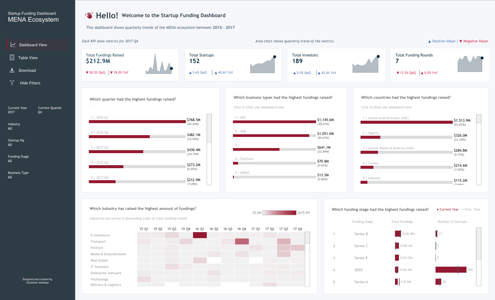 GB: My Startup Funding dashboard was created during my interview process for my current role. The idea was to showcase my skills in the context of startup funding. I found inspiration in the revenue dashboard by Pradeep Kumar from the Tableau Public community. This dashboard was meant to demonstrate my approach to unfamiliar datasets and industries, showcasing how I navigate and visualize data.
I focused on showcasing relevant KPIs, conducting research on the types of questions stakeholders in the startup funding industry might ask. This informed the KPIs I included and how I structured them by quarter to provide a comprehensive view. I used a left-sided navigation bar for easy access to different views and included features like highlighting specific months in trend graphs for user interactivity.
To frame the charts, I chose a question-based style to provoke stakeholders to engage with the data, guiding them to answers while encouraging further exploration. This approach helped me focus on specific data points I wanted to highlight, making the dashboard informative even with my limited familiarity with the dataset.
As for whitespace, padding, and typography, I was inspired by Pradeep Kumar’s work. I learned the importance of ample padding, whitespace, and clear typography for readability and visual hierarchy.
These elements were crucial in making the dashboard legible and allowing users to follow the data story effectively. Striking a balance between answering specific questions and being explorative depends on my familiarity with the dataset. In this case, I focused on specific questions due to my limited knowledge of the industry, aiming to demonstrate thorough research.
With more familiarity, I would incorporate more explorative elements to connect different data points and provide deeper insights.
CJ: Dashboards such as the Doctor Appointment dashboard bring with it a modern, website-like feel to the reporting. The booking / landing page style compliments the appointment theme. What thoughts go into designing the dashboards with “themes”?
GB: My Startup Funding dashboard was created during my interview process for my current role. The idea was to showcase my skills in the context of startup funding. I found inspiration in the revenue dashboard by Pradeep Kumar from the Tableau Public community. This dashboard was meant to demonstrate my approach to unfamiliar datasets and industries, showcasing how I navigate and visualize data.
I focused on showcasing relevant KPIs, conducting research on the types of questions stakeholders in the startup funding industry might ask. This informed the KPIs I included and how I structured them by quarter to provide a comprehensive view. I used a left-sided navigation bar for easy access to different views and included features like highlighting specific months in trend graphs for user interactivity.
To frame the charts, I chose a question-based style to provoke stakeholders to engage with the data, guiding them to answers while encouraging further exploration. This approach helped me focus on specific data points I wanted to highlight, making the dashboard informative even with my limited familiarity with the dataset.
As for whitespace, padding, and typography, I was inspired by Pradeep Kumar’s work. I learned the importance of ample padding, whitespace, and clear typography for readability and visual hierarchy.
These elements were crucial in making the dashboard legible and allowing users to follow the data story effectively. Striking a balance between answering specific questions and being explorative depends on my familiarity with the dataset. In this case, I focused on specific questions due to my limited knowledge of the industry, aiming to demonstrate thorough research.
With more familiarity, I would incorporate more explorative elements to connect different data points and provide deeper insights.
CJ: Dashboards such as the Doctor Appointment dashboard bring with it a modern, website-like feel to the reporting. The booking / landing page style compliments the appointment theme. What thoughts go into designing the dashboards with “themes”?
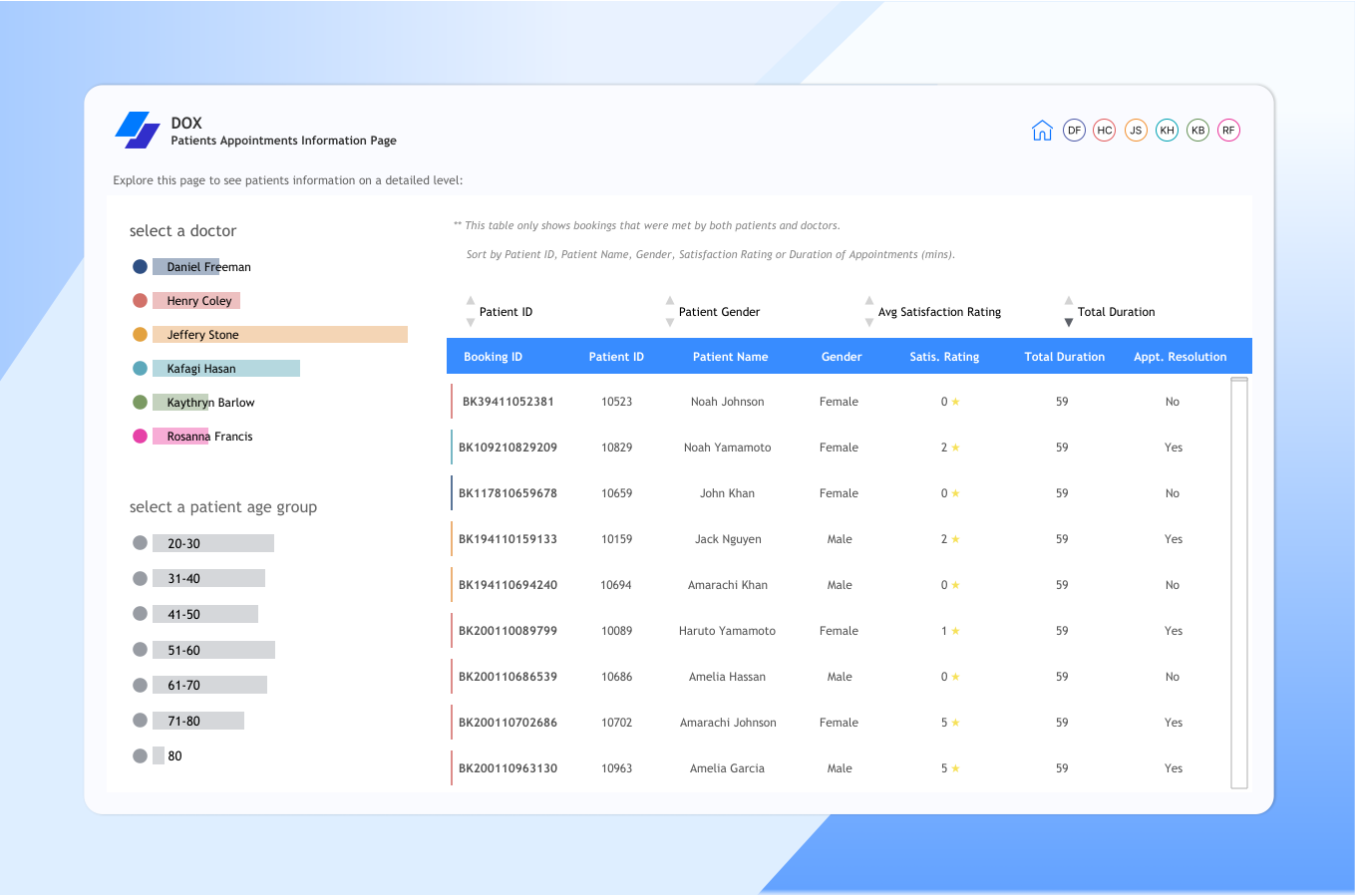 GB: When I first start building dashboards, I try to imagine what it is I'm going to want to build. Then, the most important thing I think about, before even deciding what's next, is to look for inspiration. I'm someone who constantly thrives on inspiration and wants to see what others have done, either in the data space or the UI/UX space. I explore these dashboards on platforms like Pinterest, Dribbble, and Behance to find my next source of inspiration.
Once I find a dashboard that inspires me, I choose the industry I want to apply this style to. In terms of design, I consider the theme of the dashboard in a way that fits the concept of what it's about, especially for business dashboards.
For example, with the doctor appointment dashboard, I felt that focusing on user interaction and minimizing native features to give it a modern website-like feel would suit a doctor use case. Doctors typically don't have a lot of time for extensive dropdowns, so buttons that help them quickly achieve their goals are ideal. I consider who the dashboard is targeting and how the end-product user will perceive it. The inspiration I draw from, the intended user, and my vision of the final result all play crucial roles in designing dashboards with themes.
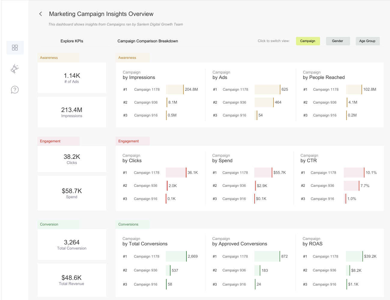
CJ: Some of your dashboards vary in terms of layout with filters and headers, left, right or at the top in the case of your marketing campaign visual. Do you think there are cases where one takes precedence over another in terms of visual hierarchy?
GB: When I first start building dashboards, I try to imagine what it is I'm going to want to build. Then, the most important thing I think about, before even deciding what's next, is to look for inspiration. I'm someone who constantly thrives on inspiration and wants to see what others have done, either in the data space or the UI/UX space. I explore these dashboards on platforms like Pinterest, Dribbble, and Behance to find my next source of inspiration.
Once I find a dashboard that inspires me, I choose the industry I want to apply this style to. In terms of design, I consider the theme of the dashboard in a way that fits the concept of what it's about, especially for business dashboards.
For example, with the doctor appointment dashboard, I felt that focusing on user interaction and minimizing native features to give it a modern website-like feel would suit a doctor use case. Doctors typically don't have a lot of time for extensive dropdowns, so buttons that help them quickly achieve their goals are ideal. I consider who the dashboard is targeting and how the end-product user will perceive it. The inspiration I draw from, the intended user, and my vision of the final result all play crucial roles in designing dashboards with themes.
CJ: Some of your dashboards vary in terms of layout with filters and headers, left, right or at the top in the case of your marketing campaign visual. Do you think there are cases where one takes precedence over another in terms of visual hierarchy?
 GB: Yes, definitely. I think there are cases where one takes precedence over another in terms of visual hierarchy, and here's my approach to it. I approach it in terms of three things:
Firstly, based on choice. Sometimes, I choose to have filters or navigation panes at the top, left, or right, based on the inspirations I work with. If I see something inspiring with a unique layout, I might incorporate that into my design purely by choice.
Secondly, the number of pages in the dashboard. If my dashboard has more than three pages, I tend to use a left-sided navigation pane to provide enough space to stack all the pages and allow easy navigation. If there are three or fewer pages, a top navigation pane can work well to show the switch between pages clearly.
Thirdly, the number of filters. For dashboards with many filters, I might use a left or right navigation that floats in the filters when selected or a top navigation that floats them from the top. It depends on what suits the layout and user experience best.
So, when building a dashboard and determining what should take precedence in terms of layouts and filters, I consider these three factors: the number of pages, the number of filters, and choice or inspiration. This approach helps ensure that the final product is not only visually appealing but also functional and user-friendly.
CJ: Your logistics and shipments dashboard is one of your best to date. From a design perspective what are you most pleased about? What subtle design techniques do you think help particularly elevate the visual?
GB: Yes, definitely. I think there are cases where one takes precedence over another in terms of visual hierarchy, and here's my approach to it. I approach it in terms of three things:
Firstly, based on choice. Sometimes, I choose to have filters or navigation panes at the top, left, or right, based on the inspirations I work with. If I see something inspiring with a unique layout, I might incorporate that into my design purely by choice.
Secondly, the number of pages in the dashboard. If my dashboard has more than three pages, I tend to use a left-sided navigation pane to provide enough space to stack all the pages and allow easy navigation. If there are three or fewer pages, a top navigation pane can work well to show the switch between pages clearly.
Thirdly, the number of filters. For dashboards with many filters, I might use a left or right navigation that floats in the filters when selected or a top navigation that floats them from the top. It depends on what suits the layout and user experience best.
So, when building a dashboard and determining what should take precedence in terms of layouts and filters, I consider these three factors: the number of pages, the number of filters, and choice or inspiration. This approach helps ensure that the final product is not only visually appealing but also functional and user-friendly.
CJ: Your logistics and shipments dashboard is one of your best to date. From a design perspective what are you most pleased about? What subtle design techniques do you think help particularly elevate the visual?
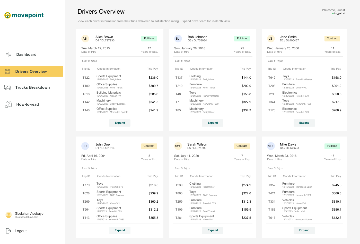 GB: I absolutely love my logistics and shipment dashboard because it's one of the dashboards I've enjoyed building the most. I had so much fun with it and drew inspiration from various dashboards, bringing everything together into one cohesive design.
The first source of inspiration came from a restaurant calculator that compared different customers. I loved the breakout view and thought it would work perfectly for any industry needing to compare multiple clients or customers, allowing for an expanded view of individual performance. The expanded view was inspired by another dashboard that broke down a customer agent's activities over a year, which I felt suited the expanded view when a driver is selected.
GB: I absolutely love my logistics and shipment dashboard because it's one of the dashboards I've enjoyed building the most. I had so much fun with it and drew inspiration from various dashboards, bringing everything together into one cohesive design.
The first source of inspiration came from a restaurant calculator that compared different customers. I loved the breakout view and thought it would work perfectly for any industry needing to compare multiple clients or customers, allowing for an expanded view of individual performance. The expanded view was inspired by another dashboard that broke down a customer agent's activities over a year, which I felt suited the expanded view when a driver is selected.
 The second page drew inspiration from a transportation business dashboard comparing trucks and vans, where selecting a vehicle switches the displayed information and image. After gathering inspiration from about four to five different dashboards, I set out to build my logistics and shipment dashboard.
 From a design perspective, this is my best work because I had a clear goal and was able to achieve it, even though it took time to create dynamic zone visibility for each driver. Subtle design techniques, like maintaining good white space to display a lot of information on a single page and ensuring visible call-to-action buttons, like 'Click here to see the full driver's information,' elevate the visual experience. I also applied the golden ratio rule for color selection, making sure my call-to-action buttons had the deepest color to immediately draw attention.
Finally, the vehicle breakdown page stands out with a scrollable interface inspired by Chimdi's email views. It allows users to click on each vehicle to see its picture, license plate, and other information, along with comparisons to other trucks or vans. All these elements together make this dashboard my favorite from a design perspective.
CJ: Your dashboards often come with a range of interactivity, be it parameter changes, filter views or navigation. What techniques do you use to help the user understand the difference? What are some of your favorite call to action design styles?
From a design perspective, this is my best work because I had a clear goal and was able to achieve it, even though it took time to create dynamic zone visibility for each driver. Subtle design techniques, like maintaining good white space to display a lot of information on a single page and ensuring visible call-to-action buttons, like 'Click here to see the full driver's information,' elevate the visual experience. I also applied the golden ratio rule for color selection, making sure my call-to-action buttons had the deepest color to immediately draw attention.
Finally, the vehicle breakdown page stands out with a scrollable interface inspired by Chimdi's email views. It allows users to click on each vehicle to see its picture, license plate, and other information, along with comparisons to other trucks or vans. All these elements together make this dashboard my favorite from a design perspective.
CJ: Your dashboards often come with a range of interactivity, be it parameter changes, filter views or navigation. What techniques do you use to help the user understand the difference? What are some of your favorite call to action design styles?
 Absolutely! I love incorporating interactivity into my dashboards, as it enhances their power and depth of insights beyond initial impressions. For interactivity, I leverage features like parameters (through dropdowns or parameter actions), filter views, navigation, and especially dynamic zone visibility, which is a favorite of mine in Tableau.
To help users differentiate between these interactive features, I maintain consistent iconography and text hierarchy. Familiar icons, like a funnel for filters or arrows for navigation, make it easier for users to understand their functions at a glance.
I also employ color and contrast to distinguish interactive elements, using softer tones for filters and bolder colors for navigation buttons. Tooltips and instructive callouts further guide users, explaining actions when hovered over, enhancing their understanding of dashboard interactivity.
As for my favorite call-to-action design styles, I enjoy using sleek, rounded buttons that emulate a web app feel, guided walkthroughs with clickable hints or step-by-step guides, and straightforward instructional text like “click here to filter” or “select to change the view,” ensuring users grasp each interactive element’s purpose without disrupting the flow.
CJ: Your design style has slowly changed in color palette to use more toned down colors, only tending to use 3-4 colors at a time on a page - with maybe one striking bold color. How has your knowledge of color utilization changed over the past year?
Absolutely! I love incorporating interactivity into my dashboards, as it enhances their power and depth of insights beyond initial impressions. For interactivity, I leverage features like parameters (through dropdowns or parameter actions), filter views, navigation, and especially dynamic zone visibility, which is a favorite of mine in Tableau.
To help users differentiate between these interactive features, I maintain consistent iconography and text hierarchy. Familiar icons, like a funnel for filters or arrows for navigation, make it easier for users to understand their functions at a glance.
I also employ color and contrast to distinguish interactive elements, using softer tones for filters and bolder colors for navigation buttons. Tooltips and instructive callouts further guide users, explaining actions when hovered over, enhancing their understanding of dashboard interactivity.
As for my favorite call-to-action design styles, I enjoy using sleek, rounded buttons that emulate a web app feel, guided walkthroughs with clickable hints or step-by-step guides, and straightforward instructional text like “click here to filter” or “select to change the view,” ensuring users grasp each interactive element’s purpose without disrupting the flow.
CJ: Your design style has slowly changed in color palette to use more toned down colors, only tending to use 3-4 colors at a time on a page - with maybe one striking bold color. How has your knowledge of color utilization changed over the past year?
 GB: Over the past year, I’ve tried to really grow in terms of design, and there’s definitely no design without appropriate color usage.
My understanding of color has evolved from working with a lot of inspirations. I’ve observed that many of these sources already have a strong grasp of color usage, often following the principle of having one bold color paired with two to three undertones. I feel this approach is especially important for business dashboards, as a consistent color theme can often relate to company branding or personal portfolio branding.
Generally, my understanding of color has grown to focus more on functionality. I think about how each color supports the story, and I find that limiting the palette to three to four colors helps reduce clutter and guides the user’s focus on the most important insights without feeling overwhelmed. Bold colors are particularly useful because they can highlight key metrics or call-to-action elements, so I make sure to reserve bold colors for the most critical parts of the data.
In terms of accessibility, I’ve also put effort into understanding color contrast and standards. I regularly read articles or watch videos on these topics, and, most importantly, I learn from the work of others. I go through many dashboards to see how colors are matched, and I think it’s been a valuable blend of insights.
CJ: I really admire the amount of effort you’ve put into paying it forward with leading the Lagos TUG. What prompted you to get involved? How have the sessions been going, and what do people have to look forward to in the coming months?
Thank you, CJ, for appreciating the work the Lagos TUG has been putting back into the community.
Getting involved felt natural because, for myself—and I’m sure for others in the Nigerian community—there’s always been a strong desire to have a vibrant Tableau user group right in the heart of Nigeria’s tech space, which is Lagos. We wanted one that’s active and impactful.
Abisola Oni, a Tableau Visionary, did an amazing job in the lead-up to the official launch of the Lagos TUG. Let me emphasize “official,” because it has existed before us, and Abisola put in significant work to bring people together to learn Tableau, visualize data, build portfolios, and refine their work. Big kudos to her for that.
However, we felt the need for a group that could be even more active and easily recognizable, with a dedicated page and a central hub where community activities are accessible. This vision birthed the Lagos TUG. The original idea didn’t come from me but from Omokehinde Ayodeji, who reached out and shared the concept of building this community together as co-leads. We also brought on two incredible co-leads, Maureen and Idris. We held initial meetings, discussed our vision, and since then, many community members have been incredibly supportive by joining the team. I think anyone who has benefited from the community naturally wants to give back, completing the cycle of learning and sharing—receiving and then giving.
GB: Over the past year, I’ve tried to really grow in terms of design, and there’s definitely no design without appropriate color usage.
My understanding of color has evolved from working with a lot of inspirations. I’ve observed that many of these sources already have a strong grasp of color usage, often following the principle of having one bold color paired with two to three undertones. I feel this approach is especially important for business dashboards, as a consistent color theme can often relate to company branding or personal portfolio branding.
Generally, my understanding of color has grown to focus more on functionality. I think about how each color supports the story, and I find that limiting the palette to three to four colors helps reduce clutter and guides the user’s focus on the most important insights without feeling overwhelmed. Bold colors are particularly useful because they can highlight key metrics or call-to-action elements, so I make sure to reserve bold colors for the most critical parts of the data.
In terms of accessibility, I’ve also put effort into understanding color contrast and standards. I regularly read articles or watch videos on these topics, and, most importantly, I learn from the work of others. I go through many dashboards to see how colors are matched, and I think it’s been a valuable blend of insights.
CJ: I really admire the amount of effort you’ve put into paying it forward with leading the Lagos TUG. What prompted you to get involved? How have the sessions been going, and what do people have to look forward to in the coming months?
Thank you, CJ, for appreciating the work the Lagos TUG has been putting back into the community.
Getting involved felt natural because, for myself—and I’m sure for others in the Nigerian community—there’s always been a strong desire to have a vibrant Tableau user group right in the heart of Nigeria’s tech space, which is Lagos. We wanted one that’s active and impactful.
Abisola Oni, a Tableau Visionary, did an amazing job in the lead-up to the official launch of the Lagos TUG. Let me emphasize “official,” because it has existed before us, and Abisola put in significant work to bring people together to learn Tableau, visualize data, build portfolios, and refine their work. Big kudos to her for that.
However, we felt the need for a group that could be even more active and easily recognizable, with a dedicated page and a central hub where community activities are accessible. This vision birthed the Lagos TUG. The original idea didn’t come from me but from Omokehinde Ayodeji, who reached out and shared the concept of building this community together as co-leads. We also brought on two incredible co-leads, Maureen and Idris. We held initial meetings, discussed our vision, and since then, many community members have been incredibly supportive by joining the team. I think anyone who has benefited from the community naturally wants to give back, completing the cycle of learning and sharing—receiving and then giving.
 What prompted me to get involved was precisely that: the opportunity to give back. I received so much support from amazing people as I was growing in Tableau, learning the platform, and advancing my skills. I believe it’s invaluable for new members to find a strong community of their own, especially here in Nigeria, where you might not see many people in your immediate environment using Tableau. Having a familiar space, where you can connect with others right here, is empowering. Seeing others use Tableau to achieve great things, get jobs, and create opportunities is exactly why I wanted to be involved. When you join an exceptional community, you can build your skills, grow, and realize that the sky is truly the limit.
In terms of the sessions, we’ve held three virtual ones so far, and we’re planning our first in-person session at the end of November. The sessions have been incredible. We’ve divided our tasks, and Maureen has done an amazing job reaching out to speakers for our events.
We’ve aimed to cover a broad spectrum of topics related to Tableau—Tableau Prep, Tableau Desktop, Tableau Cloud—and even larger themes like design, color usage, and general visualization and data modeling concepts. The sessions have been fantastic, with excellent speakers and good turnout. People are genuinely excited to join our community, contribute insights, and speak, which has been incredibly helpful.
As for what people have to look forward to in the coming months, we’re working on a boot camp this November focused on live dashboard building. Community members will be able to follow along, create these dashboards for their portfolios, and gain hands-on experience—not just with theoretical concepts but also practical application. They’ll learn how to use different aspects of Tableau to build business dashboards and creative visualizations.
Next year, we have even more exciting sessions planned, and our upcoming physical session promises to be a memorable event. So, there’s a lot to look forward to!
CJ: Is there anyone in the community that has particularly impacted your journey from a technical and design perspective? What was it about their work that you admired?
What prompted me to get involved was precisely that: the opportunity to give back. I received so much support from amazing people as I was growing in Tableau, learning the platform, and advancing my skills. I believe it’s invaluable for new members to find a strong community of their own, especially here in Nigeria, where you might not see many people in your immediate environment using Tableau. Having a familiar space, where you can connect with others right here, is empowering. Seeing others use Tableau to achieve great things, get jobs, and create opportunities is exactly why I wanted to be involved. When you join an exceptional community, you can build your skills, grow, and realize that the sky is truly the limit.
In terms of the sessions, we’ve held three virtual ones so far, and we’re planning our first in-person session at the end of November. The sessions have been incredible. We’ve divided our tasks, and Maureen has done an amazing job reaching out to speakers for our events.
We’ve aimed to cover a broad spectrum of topics related to Tableau—Tableau Prep, Tableau Desktop, Tableau Cloud—and even larger themes like design, color usage, and general visualization and data modeling concepts. The sessions have been fantastic, with excellent speakers and good turnout. People are genuinely excited to join our community, contribute insights, and speak, which has been incredibly helpful.
As for what people have to look forward to in the coming months, we’re working on a boot camp this November focused on live dashboard building. Community members will be able to follow along, create these dashboards for their portfolios, and gain hands-on experience—not just with theoretical concepts but also practical application. They’ll learn how to use different aspects of Tableau to build business dashboards and creative visualizations.
Next year, we have even more exciting sessions planned, and our upcoming physical session promises to be a memorable event. So, there’s a lot to look forward to!
CJ: Is there anyone in the community that has particularly impacted your journey from a technical and design perspective? What was it about their work that you admired?
 GB: Yes, definitely. There have been people in the community who have significantly impacted my journey from various perspectives. Honestly, it’s possible I might miss a few names because there’s so much value in the data viz community. You literally learn from everyone, whether actively or passively. Just being on Tableau Public every day allows you to learn from so many people—from how they design their dashboards, the choices they make in visualizing data, to the articles they write and the videos they share. Everyone inspires me in some way and has had an impact on me.
If I were to mention a few individuals specifically, one would definitely be Idris Akilapa. He was the first person I reached out to when I was starting, and he was incredibly supportive. He helped me understand how to connect with the community, feel comfortable sharing my work publicly, ask questions, and sometimes even land gigs. We also worked together on the “20 Ways to Build KPIs” project, which was an incredible experience and has become one of the most viewed dashboards on Tableau Public, with over one hundred thousand views—an amazing accomplishment.
Another person is Chimdi Nwosu. Chimdi has been pivotal, especially from a design perspective. His visualizations were the first ones I saw on Tableau Public that truly inspired me to step up my design skills and think more deeply about how I present information.
In terms of design, Chimdi has been particularly supportive. Earlier this year, we decided to set up a weekly Sunday meeting where we’d spend an hour discussing design, any questions I had, and the projects I was working on at the time. We’d share ideas, talk about the best ways to approach certain challenges, and work through technical or calculation issues. Chimdi’s been a huge help, both creatively and technically.
My good friend Michael Fajemilehin has also been an incredible resource, especially on the technical side. He’s very skilled with Tableau calculations, and we often bounce ideas off each other whenever I’m working on something complex. He’s been instrumental in my journey from a technical perspective.
Then there are others like Zainab Ayodimeji and Abisola Oni, along with other talented Tableau people in Nigeria. Seeing what they can accomplish from here has been a huge motivation, reminding me that I can push my limits too.
On a broader scale, I’m a big fan of Judit Becker’s work. I love seeing how her ideas come to life in Tableau; she’s truly inspiring. And of course, CJ, you’ve been a huge influence as well. From the start, we’ve had meaningful conversations that go beyond just technical or design advice. We’ve discussed the data visualization field and Tableau community as a whole, shaping my perspective on what to pursue next. I remember the incredible advice you gave me after the Vizzes award for Notable Newbie—it really shaped my direction after that.
There are so many others, like Andy Kriebel, Flerlage Twins, Adedamola Ladipo and Sarah Barlett. I could probably keep listing names all day. Each of these amazing people has been incredibly helpful in different ways—Chimdi for his design insights, Idris for showing me what’s possible here, and you, CJ, for your guidance and constant willingness to offer advice. This community has been a huge part of my journey, and I’m grateful to everyone who’s played a role.
LOGGING OFF,
CJ
GB: Yes, definitely. There have been people in the community who have significantly impacted my journey from various perspectives. Honestly, it’s possible I might miss a few names because there’s so much value in the data viz community. You literally learn from everyone, whether actively or passively. Just being on Tableau Public every day allows you to learn from so many people—from how they design their dashboards, the choices they make in visualizing data, to the articles they write and the videos they share. Everyone inspires me in some way and has had an impact on me.
If I were to mention a few individuals specifically, one would definitely be Idris Akilapa. He was the first person I reached out to when I was starting, and he was incredibly supportive. He helped me understand how to connect with the community, feel comfortable sharing my work publicly, ask questions, and sometimes even land gigs. We also worked together on the “20 Ways to Build KPIs” project, which was an incredible experience and has become one of the most viewed dashboards on Tableau Public, with over one hundred thousand views—an amazing accomplishment.
Another person is Chimdi Nwosu. Chimdi has been pivotal, especially from a design perspective. His visualizations were the first ones I saw on Tableau Public that truly inspired me to step up my design skills and think more deeply about how I present information.
In terms of design, Chimdi has been particularly supportive. Earlier this year, we decided to set up a weekly Sunday meeting where we’d spend an hour discussing design, any questions I had, and the projects I was working on at the time. We’d share ideas, talk about the best ways to approach certain challenges, and work through technical or calculation issues. Chimdi’s been a huge help, both creatively and technically.
My good friend Michael Fajemilehin has also been an incredible resource, especially on the technical side. He’s very skilled with Tableau calculations, and we often bounce ideas off each other whenever I’m working on something complex. He’s been instrumental in my journey from a technical perspective.
Then there are others like Zainab Ayodimeji and Abisola Oni, along with other talented Tableau people in Nigeria. Seeing what they can accomplish from here has been a huge motivation, reminding me that I can push my limits too.
On a broader scale, I’m a big fan of Judit Becker’s work. I love seeing how her ideas come to life in Tableau; she’s truly inspiring. And of course, CJ, you’ve been a huge influence as well. From the start, we’ve had meaningful conversations that go beyond just technical or design advice. We’ve discussed the data visualization field and Tableau community as a whole, shaping my perspective on what to pursue next. I remember the incredible advice you gave me after the Vizzes award for Notable Newbie—it really shaped my direction after that.
There are so many others, like Andy Kriebel, Flerlage Twins, Adedamola Ladipo and Sarah Barlett. I could probably keep listing names all day. Each of these amazing people has been incredibly helpful in different ways—Chimdi for his design insights, Idris for showing me what’s possible here, and you, CJ, for your guidance and constant willingness to offer advice. This community has been a huge part of my journey, and I’m grateful to everyone who’s played a role.
LOGGING OFF,
CJ