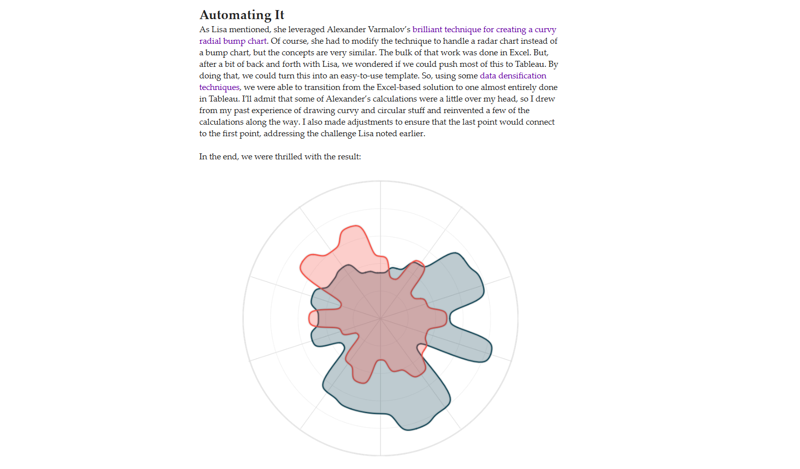
Hi all,
A warm welcome back to another blog, and this week, Seun has kindly offered up his time to share a really neat inverse polygon trick in Tableau.
Just check out this radar, it works so well with the glassmorphism background.
Seuns profile is so visually striking, it is of no surprise he picked up an award at this years Tableau conference. So i'm glad he is here to share his expertise through a inverse radar template today.
Before we jump in Seun, for those wanting to learn more about you can you describe how you got into data?
S: Hi! My name is Seun Adeyemo. I’m based in Lagos, Nigeria. I love Art, in fact, it was my first love. As a teenager my passion was drawing (with pencils), painting with water colours (sometimes oil paint), and I did lots of beautiful crafts. After high school, I taught kids with similar passion how to make beautiful stuffs like card greetings, straw mats, cardboard designs, tie and dye, etc.
But i also love Mathematics, because to me it’s about solving problems by employing both logical and analytical reasoning. I went on to studying further mathematics, In the end, I produced a further mathematics textbook!
After studying Economics at university, I grew more of a passion for graphs, and by chance I found Tableau in 2018. It was the perfect software that allowed me to blend everything together (Art, Math & Economics).
After some practice, I started training university students every year. And you know, you become an expert more by teaching, so here I am now!
Now let's get into the tutorial.
So, how did I develop the first inverse chart of that curvy radar?
Sincerely I think the credit needs to go to Ken Flerlage who with Lisa Trescott and Kevin Flerlage created the first curvy radar on Tableau. I was trying to build a curve style radar and so I remembered that I read Ken’s article on that sometime ago. So I went back to
the article, downloaded the chart and then got to work.
You can read it here.
I would save the explanation on how to build a curvy radar as that has already been explained best by Ken in his website. So, I’d just go straight to explaining how I built the inverse of it and created a see-through effect.
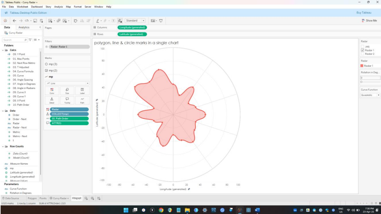
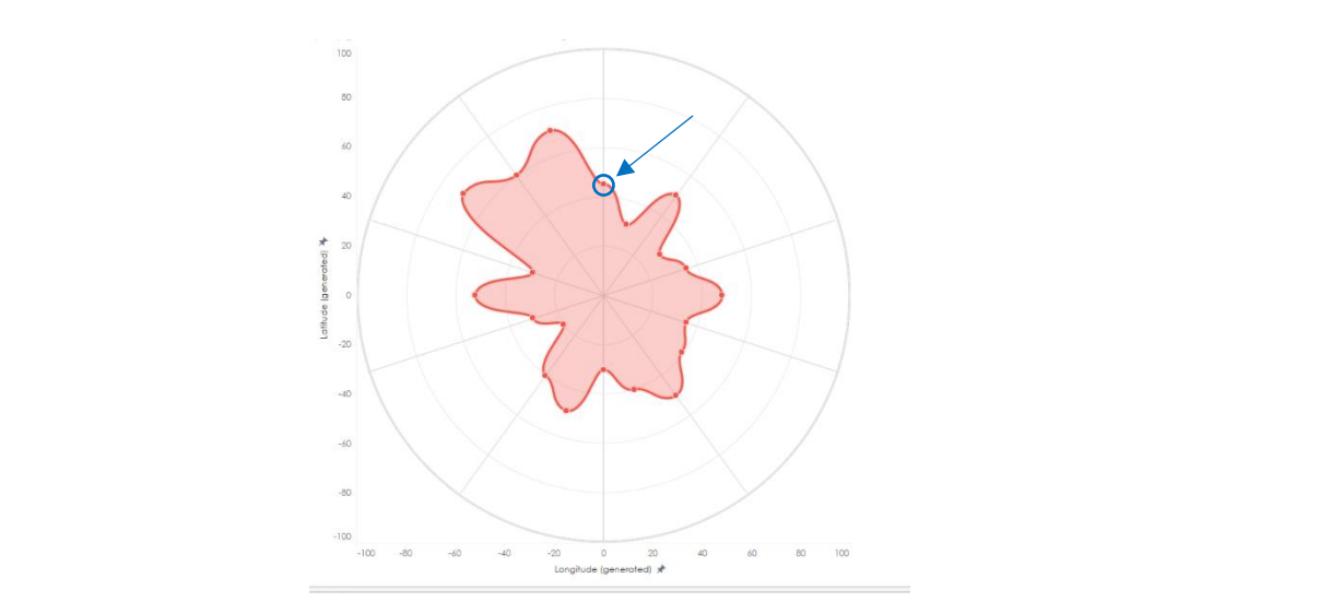
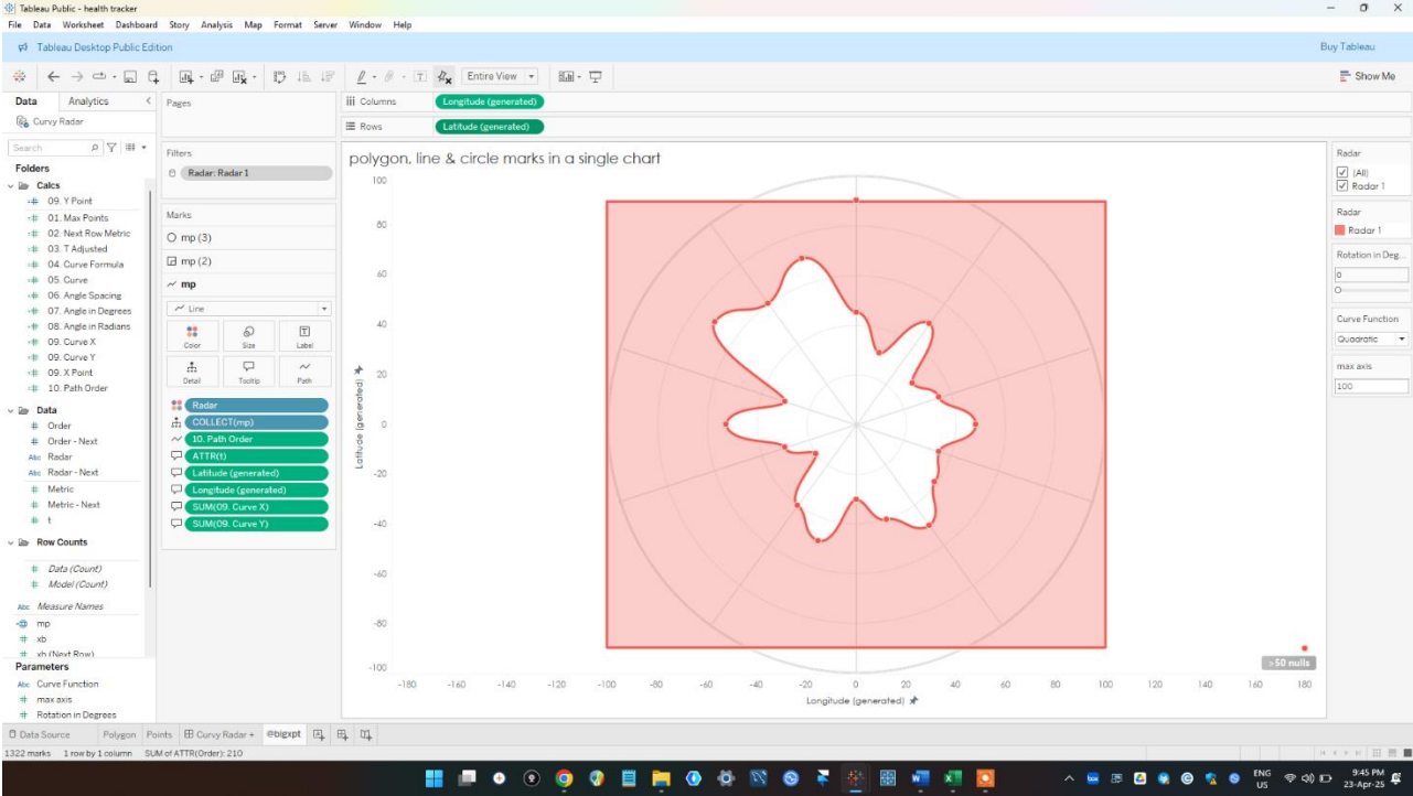
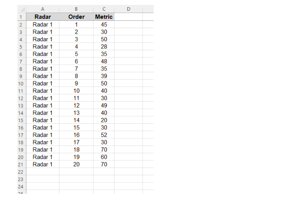
So, here’s what we got, the Radar 1 from Ken’ template. We all know this is a polygon, which means there are points and these points “connect” together, essentially the last data point is connected to the first data point.
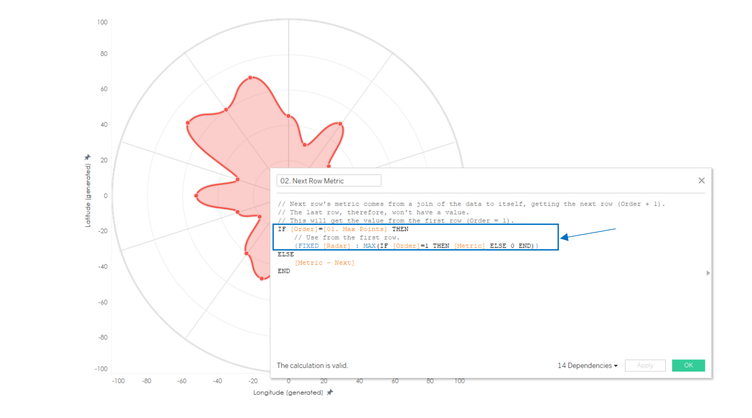
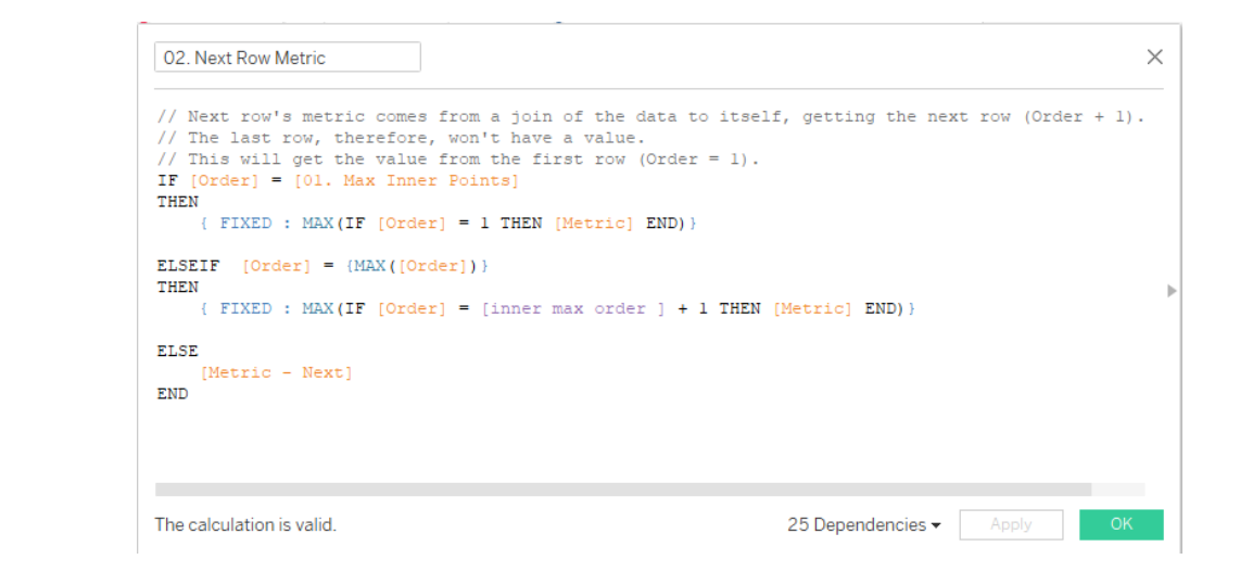
You say, how do I know it’s that point? Well Ken’s calculated field 02. Next Row Metric says that here!
It says if the data point is at its end (max point), the next row should be the value of the first data point (…if order = 1 then metric…), also note this was fixed.
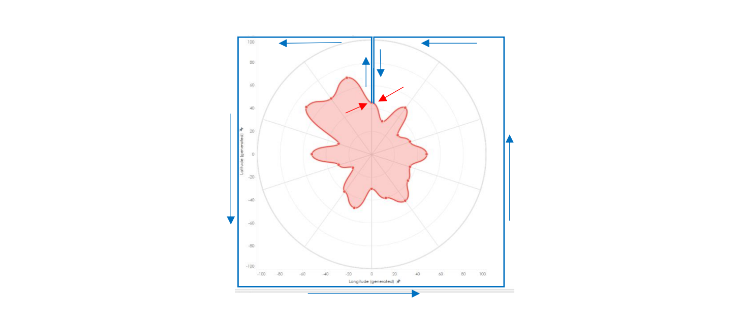
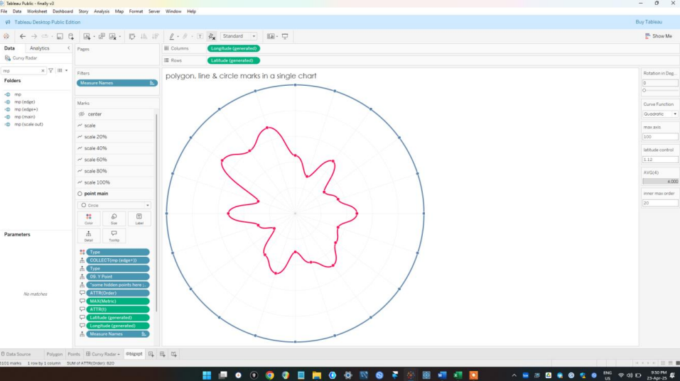
So, I thought, what if we extend this data point from the last point, so that it goes rectangular around the data view and back into the radar shape meeting with the first data point. This was what I had in mind.
And this was what I eventually built
I was feeling excited after building this. Though it was not perfectly what I wanted but I knew I was getting close. I viewed the polygon style and got plenty questions and debugging to do.
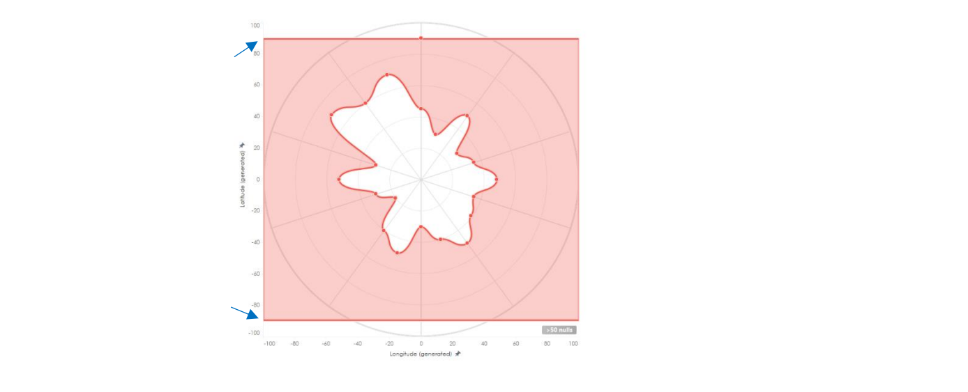
First was, why was by polygon cutting the top and bottom of the circle? I spent over 2 hours trying to solve this, thinking it was a problem in my data or code settings. I completely forgot that this was a plot of latitude and longitude, and that latitude does not exceed 90°, so. How could you Seun!!! a whole 2 hours!!!
Well, there’s still a lot to do, for the passion we don’t give up...I fixed that and moved quickly onto building this.
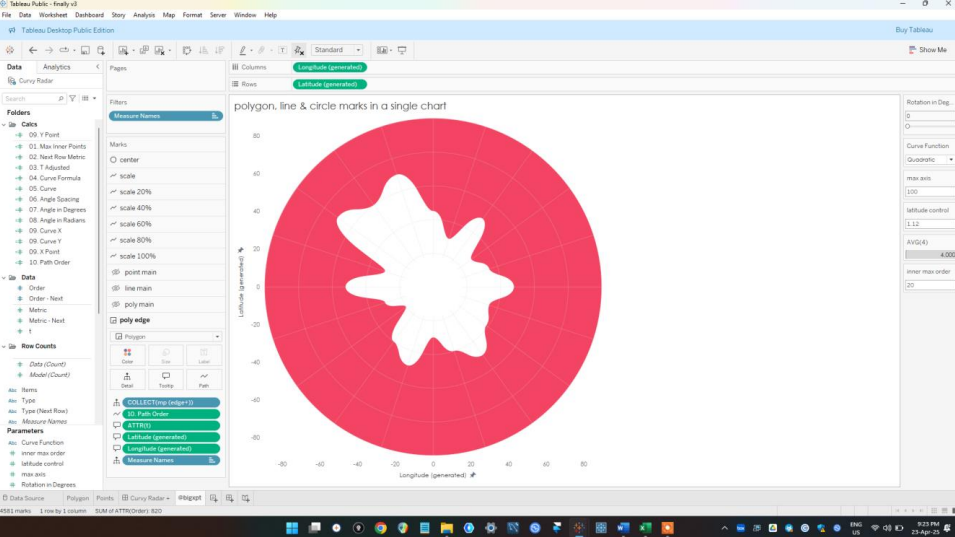
Now that might feel like a massive leap in steps, but let me break it down in more detail.
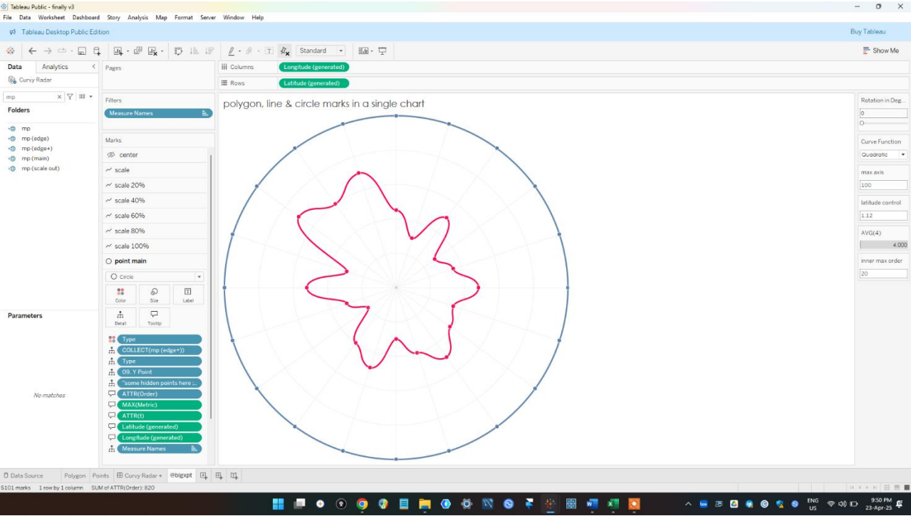
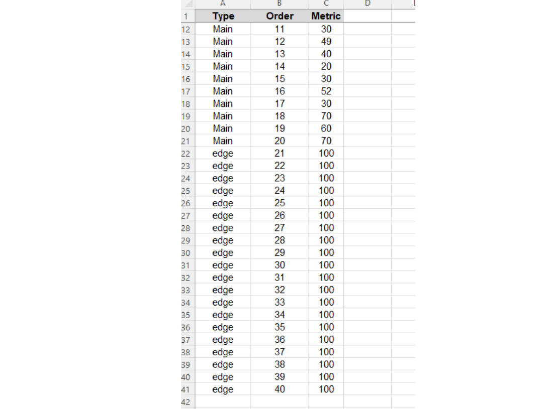
Yes we no longer have a rectangular shape outside, it’s now a circle. This happened because I doubled the number of data points.
You see the from Ken’s template, there are 20 data points (I’ll be using Radar 1 to explain this)
So, I doubled the data points, 20 for inner (for the red line), and 20 for outer (for the blue). He already created the ones for the inner, so the ones for the outer would be easy because there would be the same numbers which is the maximum data point in the circle (that’s 100 in this case).
As you can see, there is an inner (Main) and the outer (edge). And for the Order 21 to 40 the values (metrics) are 100 which is the max value in this example.
This was what I used instead of the original template, and then, using the same model densification style, I adjusted some of the calculated fields.
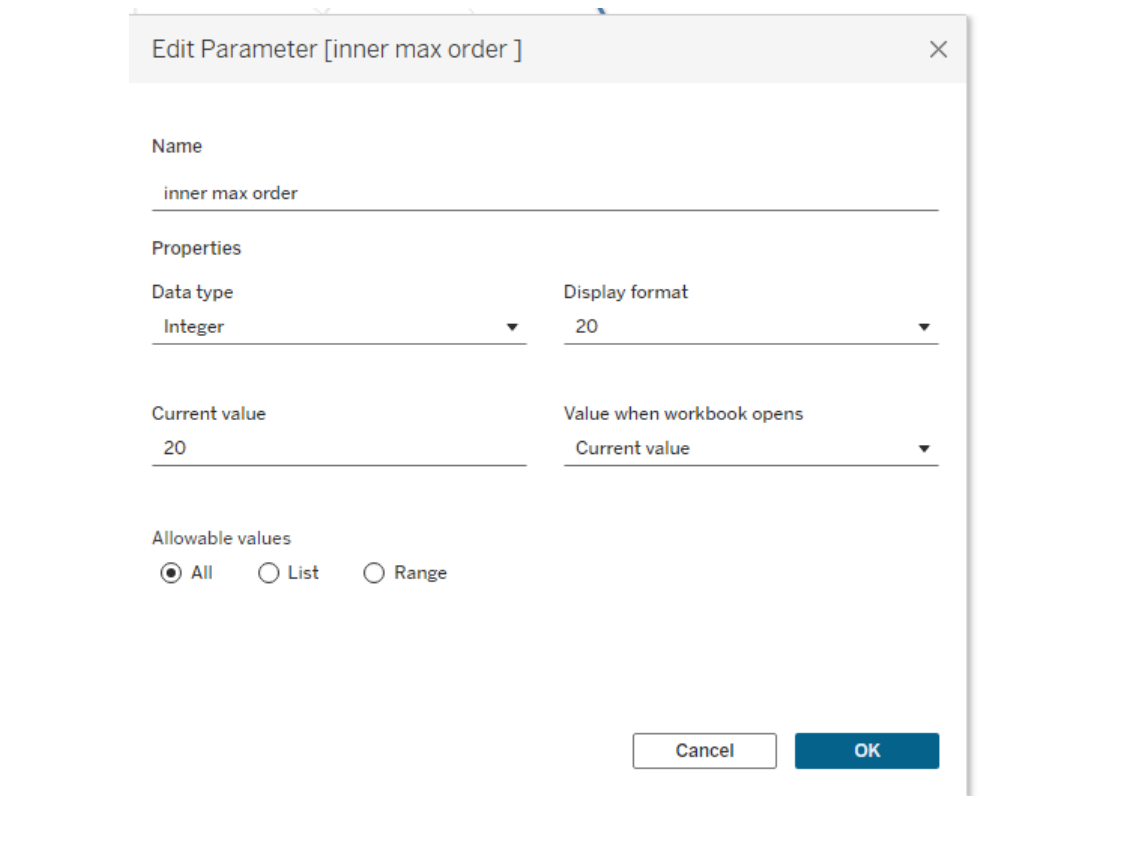
First, I created an integer parameter and named it inner max order. This was the maximum order value in the inner polygon which is 20.
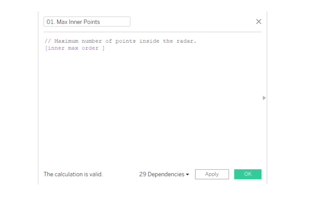
Next, I adjusted 01. Max Points I renamed it to 01. Max Inner Points and used this calculation
Next, I adjusted the calculated field 02. Next Row Metric
This joins the last inner data point (order 20) to the first inner data point (order 1). Also, for the outer, max order (order 40), will be with joined to the first outer (order 21) that explains “inner max order + 1”.
So that’s it! All the other calculated fields where left the same as Ken created them. So again, much credits to Ken. I just made a few changes and so we have this.
And after adjusting latitude and longitude so I don’t waste another 2 hours, we have as a polygon this.
If you'd like to give it a go.... you can find the template i made here.
You will find I added a little bonus feature. To understand this better, just explore the idea and see what more you can develop from it! Enjoy.
CJ Round-up:
Wow I am seriously impressed with the creativity behind inversing the radar. I think this has major potential if used in a neat way like Seun's original visual to help layer different elements. Seun has built an incredible portfolio to date, and it has been amazing to watch his presence grow in the data community. Make sure to check out his profile in full.LOGGING OFF,
CJ
 Seuns profile is so visually striking, it is of no surprise he picked up an award at this years Tableau conference. So i'm glad he is here to share his expertise through a inverse radar template today.
 Before we jump in Seun, for those wanting to learn more about you can you describe how you got into data?
S: Hi! My name is Seun Adeyemo. I’m based in Lagos, Nigeria. I love Art, in fact, it was my first love. As a teenager my passion was drawing (with pencils), painting with water colours (sometimes oil paint), and I did lots of beautiful crafts. After high school, I taught kids with similar passion how to make beautiful stuffs like card greetings, straw mats, cardboard designs, tie and dye, etc.
But i also love Mathematics, because to me it’s about solving problems by employing both logical and analytical reasoning. I went on to studying further mathematics, In the end, I produced a further mathematics textbook!
After studying Economics at university, I grew more of a passion for graphs, and by chance I found Tableau in 2018. It was the perfect software that allowed me to blend everything together (Art, Math & Economics).
After some practice, I started training university students every year. And you know, you become an expert more by teaching, so here I am now!
Now let's get into the tutorial.
So, how did I develop the first inverse chart of that curvy radar?
Sincerely I think the credit needs to go to Ken Flerlage who with Lisa Trescott and Kevin Flerlage created the first curvy radar on Tableau. I was trying to build a curve style radar and so I remembered that I read Ken’s article on that sometime ago. So I went back to
the article, downloaded the chart and then got to work.
You can read it here.
Before we jump in Seun, for those wanting to learn more about you can you describe how you got into data?
S: Hi! My name is Seun Adeyemo. I’m based in Lagos, Nigeria. I love Art, in fact, it was my first love. As a teenager my passion was drawing (with pencils), painting with water colours (sometimes oil paint), and I did lots of beautiful crafts. After high school, I taught kids with similar passion how to make beautiful stuffs like card greetings, straw mats, cardboard designs, tie and dye, etc.
But i also love Mathematics, because to me it’s about solving problems by employing both logical and analytical reasoning. I went on to studying further mathematics, In the end, I produced a further mathematics textbook!
After studying Economics at university, I grew more of a passion for graphs, and by chance I found Tableau in 2018. It was the perfect software that allowed me to blend everything together (Art, Math & Economics).
After some practice, I started training university students every year. And you know, you become an expert more by teaching, so here I am now!
Now let's get into the tutorial.
So, how did I develop the first inverse chart of that curvy radar?
Sincerely I think the credit needs to go to Ken Flerlage who with Lisa Trescott and Kevin Flerlage created the first curvy radar on Tableau. I was trying to build a curve style radar and so I remembered that I read Ken’s article on that sometime ago. So I went back to
the article, downloaded the chart and then got to work.
You can read it here.
 I would save the explanation on how to build a curvy radar as that has already been explained best by Ken in his website. So, I’d just go straight to explaining how I built the inverse of it and created a see-through effect.
 So, here’s what we got, the Radar 1 from Ken’ template. We all know this is a polygon, which means there are points and these points “connect” together, essentially the last data point is connected to the first data point.
 You say, how do I know it’s that point? Well Ken’s calculated field 02. Next Row Metric says that here!
 It says if the data point is at its end (max point), the next row should be the value of the first data point (…if order = 1 then metric…), also note this was fixed.
So, I thought, what if we extend this data point from the last point, so that it goes rectangular around the data view and back into the radar shape meeting with the first data point. This was what I had in mind.
It says if the data point is at its end (max point), the next row should be the value of the first data point (…if order = 1 then metric…), also note this was fixed.
So, I thought, what if we extend this data point from the last point, so that it goes rectangular around the data view and back into the radar shape meeting with the first data point. This was what I had in mind.
 And this was what I eventually built
 First was, why was by polygon cutting the top and bottom of the circle? I spent over 2 hours trying to solve this, thinking it was a problem in my data or code settings. I completely forgot that this was a plot of latitude and longitude, and that latitude does not exceed 90°, so. How could you Seun!!! a whole 2 hours!!!
 Well, there’s still a lot to do, for the passion we don’t give up...I fixed that and moved quickly onto building this.
 Now that might feel like a massive leap in steps, but let me break it down in more detail.
Yes we no longer have a rectangular shape outside, it’s now a circle. This happened because I doubled the number of data points.
You see the from Ken’s template, there are 20 data points (I’ll be using Radar 1 to explain this)
Now that might feel like a massive leap in steps, but let me break it down in more detail.
Yes we no longer have a rectangular shape outside, it’s now a circle. This happened because I doubled the number of data points.
You see the from Ken’s template, there are 20 data points (I’ll be using Radar 1 to explain this)
 So, I doubled the data points, 20 for inner (for the red line), and 20 for outer (for the blue). He already created the ones for the inner, so the ones for the outer would be easy because there would be the same numbers which is the maximum data point in the circle (that’s 100 in this case).
 As you can see, there is an inner (Main) and the outer (edge). And for the Order 21 to 40 the values (metrics) are 100 which is the max value in this example.
This was what I used instead of the original template, and then, using the same model densification style, I adjusted some of the calculated fields.
First, I created an integer parameter and named it inner max order. This was the maximum order value in the inner polygon which is 20.
As you can see, there is an inner (Main) and the outer (edge). And for the Order 21 to 40 the values (metrics) are 100 which is the max value in this example.
This was what I used instead of the original template, and then, using the same model densification style, I adjusted some of the calculated fields.
First, I created an integer parameter and named it inner max order. This was the maximum order value in the inner polygon which is 20.
 Next, I adjusted 01. Max Points I renamed it to 01. Max Inner Points and used this calculation
 Next, I adjusted the calculated field 02. Next Row Metric
 This joins the last inner data point (order 20) to the first inner data point (order 1). Also, for the outer, max order (order 40), will be with joined to the first outer (order 21) that explains “inner max order + 1”.
So that’s it! All the other calculated fields where left the same as Ken created them. So again, much credits to Ken. I just made a few changes and so we have this.
This joins the last inner data point (order 20) to the first inner data point (order 1). Also, for the outer, max order (order 40), will be with joined to the first outer (order 21) that explains “inner max order + 1”.
So that’s it! All the other calculated fields where left the same as Ken created them. So again, much credits to Ken. I just made a few changes and so we have this.
 And after adjusting latitude and longitude so I don’t waste another 2 hours, we have as a polygon this.
 If you'd like to give it a go.... you can find the template i made here.
You will find I added a little bonus feature. To understand this better, just explore the idea and see what more you can develop from it! Enjoy.
CJ Round-up:
Wow I am seriously impressed with the creativity behind inversing the radar. I think this has major potential if used in a neat way like Seun's original visual to help layer different elements. Seun has built an incredible portfolio to date, and it has been amazing to watch his presence grow in the data community. Make sure to check out his profile in full.
LOGGING OFF,
CJ
If you'd like to give it a go.... you can find the template i made here.
You will find I added a little bonus feature. To understand this better, just explore the idea and see what more you can develop from it! Enjoy.
CJ Round-up:
Wow I am seriously impressed with the creativity behind inversing the radar. I think this has major potential if used in a neat way like Seun's original visual to help layer different elements. Seun has built an incredible portfolio to date, and it has been amazing to watch his presence grow in the data community. Make sure to check out his profile in full.
LOGGING OFF,
CJ