Hi all,
I am joined by Tanya Lomskaya this week. We had the opportunity to talk through her wonderfully designed portfolio of work and a few tips when it comes to utilising a range of toolkits to create work.
Find our conversation below,
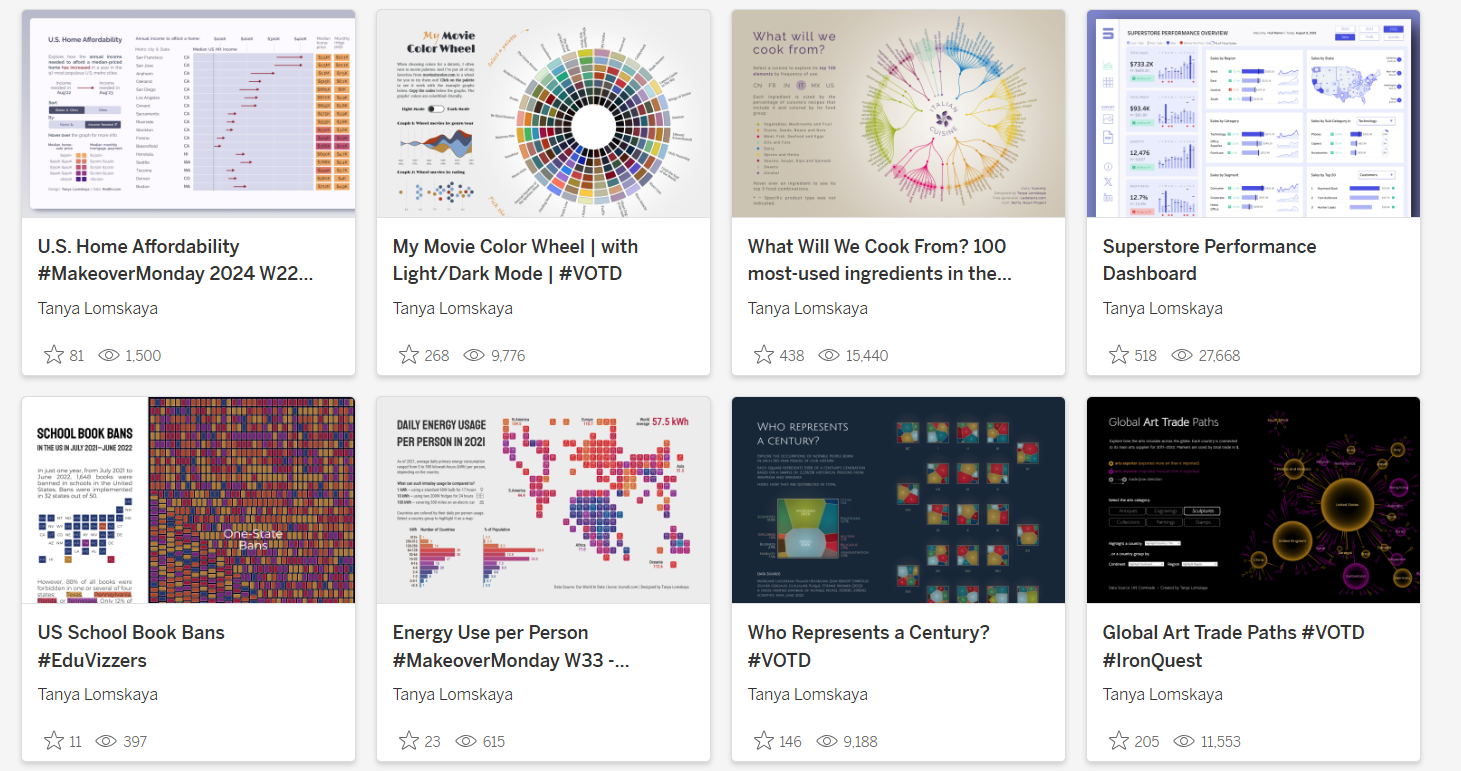
CJ: Tanya, thank you for giving up time to share more on your portfolio of work. What was your entry point into the world of data? Did your background in Economics and finance push you this way? T: It is difficult for me to pinpoint a specific entry point. I received a degree in sociology but didn’t pursue a career in it. I dreamed of becoming a journalist, and so after graduating from university in Minsk, I went to Moscow to make my dream come true. I became a journalist and spent eight years in large business publications, writing first about stock and insurance markets, then about macroeconomics, central bank and budget policy.Business journalists who write for print can be divided into two types. The first are focused on establishing and maintaining relationships with sources—officials and top managers of companies—who leak information to them from time to time. The second work more with open data: they track business indicators and government statistics and interact with analysts and scientists. I belonged to the second type.If you want some parallel with the work of an analyst, then my first job was to identify outliers—events and indicators that stand out from the general trend—and try to understand why they happened, whether there had been some significant social or business event behind them. Such a statistical anomaly could turn out to be an unnoticed consequence of government cover-ups—in one case out of a hundred. In the remaining 99 cases, there is nothing worth nationwide reporting behind such outliers, and you spend tens of hours just to reapprove this simple truth.I obviously needed tools to speed up the processing of information so that we could check the newsworthiness of statistical events more quickly. I started learning Python and writing scripts to process government statistics, tax returns, and the like. It was quite fun, because some economists and researchers I was collaborating with also started coding at the time. It expanded their ability to do research so much, and there were some just phenomenal ideas there. I learned a lot from the people I was surrounded by at the time; they changed my view of working with data and generally my view of the world in many ways.CJ: You have a wonderful eye for design, that goes beyond just Tableau visuals and the technical proficiency needed to create such elegant pieces. For your more recent “Our Worlds Aging” visual, how do you go about planning a map piece with data “layers” of the area charts and circles. T: I borrowed the two-layer map model from Klaus Schulte's IronViz 2019 entry.I was hooked by the ability to display the indicator as both a current static value (the area of the underlying circle) and a historical trend (the height of the overlaying bars), and all this with a geographic breakdown.I decided to apply his approach to visualizing the aging of the world's population, with a slight twist. While the polygons show the dynamics of elderly population share since 1963, the resulting percentage is expressed not by the size but by the colour of the underlying circle, while its size represents the total population in the last year of observation. This allows us to see, for example, not just the significant current share of elderly people in China, but also how much China contributes to the global picture of aging, given its huge population.I also added annotations to bring the demographic information to life and set context for the whole narrative.CJ: From a technical aspect, I love that you’re willing to share more complex charts in Tableau. Going beyond your medium blog on graphviz, are there any other charts that you’d like to replicate in the future? How do you go about planning non-standard chart types design?T: I think that the need for a non-standard chart design mostly arises when you want to depict some complex phenomenon as a whole, without breaking it down into separate indicators. So initially, the audience sees just one graph, which, upon closer inspection, breaks down into many details.Take, for example, the timeline in the form of a curved area bump chart like this one from Robert Janezic. First, you see the timeline as a whole, along with a couple of genres that finished most popular; then you change the lens and see the path of each genre individually. Then you focus on half-decade percentage distributions; finally, you dig into the story behind the annotations. I tried to create something similar, but so far nothing worthy has come out.Also, I'd really like to find a way to create Dorling cartograms like this one from IIBA-2016, but in TableauThis seems like a really challenging idea, because other than the one mentioned above, I've seen maybe one or two visualizations of this type that actually looked good and not just like unintegrated bubbles. So far, the best attempt in Tableau was by Raisa Hannus; you wrote about it last year.Besides these, I'm fond of recursive Voronoi generative arts, like this fractal made with D3.js. I’ve written Python code to generate this kind of graph for Tableau but have not yet found a topic to use it on.CJ: Often for tableau visuals now in public, a whole range of tools get used to create them both for inspiration, data prep and design. Do you have a few “go-to’s” you can share that might help others elevate their own visuals?T: If you love creative visualizations, then your path in any case lies in the direction of D3.js or Python. For Pythonists, I can advise paying attention to the Shapely library for generating and transforming polygons, SciPy BPoly for generating curves, and PIL for image processing.
> Shapley
> SciPy
> PillowIf you're not yet a coder, my go-to is to become one.(Just kidding.)(Or not.)I also always recommend studying Inkscape, an open-source Figma-like package, but more oriented towards visual design. The most basic thing you can do with it is to extract the SVG file with labels fromLadataviz.com, change their colour, font, and size, and then upload the resulting image to Tableau as a background for your chart. You can do a variety of more advanced text tricks, generate visual effects for your background and navigation elements, and create the most intricate shapes—there are plenty of tutorials on this topic on YouTube.CJ: You’ve done some work on dashboard design using other tools and technology, like your precious metals piece. You reference some places to help you get started with Dribble, Dash, Plotly and stackoverflow. With advances in AI and prompts, what build aspects will become easier?T: This will change the whole process of creating apps. I tried creating an app in Plotly Studio, which is currently in beta testing; the experience reminded me of working with Midjourney. You don't need to know coding at all.It feels like dashboard/app creation is changing its nature. Instead of developing from scratch, we will improve in interacting with AI, while our technical skills will drift towards revising and correcting AI creations.CJ: Chord charts are not easy! Your visualization on GoT covers all 8 seasons with colour-coded indicators - what design challenges did you face in representing such an extensive timeline in a single visualization while maintaining clarity about how character interactions evolved over time?T: 90 percent of the entire creative process in this case happened outside of Tableau. I calculated the coordinates for all three layers of the chord—nodes, links, and edge polygons—using Python. (By the way, I learned to build all these elements in Python thanks to a cool tutorial on radial bar charts from the Flerlage twins: I simply replaced the Excel functions from their step-by-step manual with Python ones and began to calculate the coordinates for all my radial graphs.)I created all the labels for the chord usingLadataviz.com and Inkscape. Then I turned to Tableau to connect it all, attach the necessary backgrounds to the necessary graphs, and set up navigation between the elements. The final design is simple: in addition to the chord itself, there are toggle buttons for switching between seasons and instructions on how to use the graph.The main challenge here was the amount of preliminary work: developing the code and generating multiple background images.CJ: Your circular or chord visuals “Who's In The Spotlight?”, “My Movie Color Wheel” & “What Will We Cook From?” are all the centre focus of the visual. Is this a conscious decision? How do you weigh up what other charts or text to align on the page so as to not detract from the main visual.T: Everything that goes beyond the circle is perceived as the periphery—hence this design. Almost all important information is contained within the circle, and everything outside is either legends, navigation elements, or auxiliary charts. This approach seems very common; I have seen many authors utilizing it. Whenever I create a radial, I place it exactly like this.CJ: What has been your favourite visual to make and why?T: If you mean which of my visualizations left the most positive emotions while developing, it's "Who Represents a Century." It was a purely creative process from start to finish, more like a game, based on a very interesting dataset. All the way I was focused on the visual part and creating a certain perception that I needed. And the cherry on the cake is how warmly the result was welcomed by the community.CJ: What guided your decision to use Voronoi diagrams to represent occupational distributions rather than more conventional charts, and how does this visual approach enhance the storytelling about historical representation?T: It was done more on a whim, but here's how I explain the idea. Sciences Po cleaned up and systematized Wikipedia data on people of different professions who lived in different eras, up to the present day. But Wikipedia is not an objective source of knowledge about the inhabitants of a particular time. It contains information only about those people who, for some reason, remained in the memory of mankind.In other words, this data is about our perception or fantasy about the past, not about the objective truth. Thus, the idea was to simultaneously show you each century's proportions and somehow make you doubt them.Voronoi came in perfect for this. Apart from the stated effect, this graph resembles a mosaic or stained glass, which is strongly associated with history, or abstract art, which completely appeals to our subjective perception. To enhance this impression, I gave the graphs the appearance of an art gallery.CJ: In the wider data visualisation community, are there any portfolios of work that have really inspired your journey, or made you think “wow I’d like to make something like that!”?T: There are actually a lot of people about whose work or entire portfolios I think, “Wow.” Let me list only those who have significantly influenced the creation of the visualizations already published in my portfolio. These are the Flerlage twins, Andy Kriebel, Chimdi Nwosu, Priya Padham, Pradeep Kumar G, Kevin Wee, Dennis Kao, Wendy Shijia, Klaus Schulte, Will Sutton, and Damola Ladipo.CJ: Are you working on any exciting personal projects?T: I have been wanting to start making maps for a long time now, as I am incredibly inspired by the work of Dennis Kao, Nir Smilga, Naresh Suglani, and George Koursaros. Next, I want to continue the theme of representation of people in history, but this time focusing exclusively on women. I am curious what the data will show. And at some point in the future, I would like to do a project dedicated to my home country, Belarus.Have a great week ahead!LOGGING OFF,
CJ
 T: It is difficult for me to pinpoint a specific entry point. I received a degree in sociology but didn’t pursue a career in it. I dreamed of becoming a journalist, and so after graduating from university in Minsk, I went to Moscow to make my dream come true. I became a journalist and spent eight years in large business publications, writing first about stock and insurance markets, then about macroeconomics, central bank and budget policy.
Business journalists who write for print can be divided into two types. The first are focused on establishing and maintaining relationships with sources—officials and top managers of companies—who leak information to them from time to time. The second work more with open data: they track business indicators and government statistics and interact with analysts and scientists. I belonged to the second type.
If you want some parallel with the work of an analyst, then my first job was to identify outliers—events and indicators that stand out from the general trend—and try to understand why they happened, whether there had been some significant social or business event behind them. Such a statistical anomaly could turn out to be an unnoticed consequence of government cover-ups—in one case out of a hundred. In the remaining 99 cases, there is nothing worth nationwide reporting behind such outliers, and you spend tens of hours just to reapprove this simple truth.
I obviously needed tools to speed up the processing of information so that we could check the newsworthiness of statistical events more quickly. I started learning Python and writing scripts to process government statistics, tax returns, and the like. It was quite fun, because some economists and researchers I was collaborating with also started coding at the time. It expanded their ability to do research so much, and there were some just phenomenal ideas there. I learned a lot from the people I was surrounded by at the time; they changed my view of working with data and generally my view of the world in many ways.
CJ: You have a wonderful eye for design, that goes beyond just Tableau visuals and the technical proficiency needed to create such elegant pieces. For your more recent “Our Worlds Aging” visual, how do you go about planning a map piece with data “layers” of the area charts and circles.
T: It is difficult for me to pinpoint a specific entry point. I received a degree in sociology but didn’t pursue a career in it. I dreamed of becoming a journalist, and so after graduating from university in Minsk, I went to Moscow to make my dream come true. I became a journalist and spent eight years in large business publications, writing first about stock and insurance markets, then about macroeconomics, central bank and budget policy.
Business journalists who write for print can be divided into two types. The first are focused on establishing and maintaining relationships with sources—officials and top managers of companies—who leak information to them from time to time. The second work more with open data: they track business indicators and government statistics and interact with analysts and scientists. I belonged to the second type.
If you want some parallel with the work of an analyst, then my first job was to identify outliers—events and indicators that stand out from the general trend—and try to understand why they happened, whether there had been some significant social or business event behind them. Such a statistical anomaly could turn out to be an unnoticed consequence of government cover-ups—in one case out of a hundred. In the remaining 99 cases, there is nothing worth nationwide reporting behind such outliers, and you spend tens of hours just to reapprove this simple truth.
I obviously needed tools to speed up the processing of information so that we could check the newsworthiness of statistical events more quickly. I started learning Python and writing scripts to process government statistics, tax returns, and the like. It was quite fun, because some economists and researchers I was collaborating with also started coding at the time. It expanded their ability to do research so much, and there were some just phenomenal ideas there. I learned a lot from the people I was surrounded by at the time; they changed my view of working with data and generally my view of the world in many ways.
CJ: You have a wonderful eye for design, that goes beyond just Tableau visuals and the technical proficiency needed to create such elegant pieces. For your more recent “Our Worlds Aging” visual, how do you go about planning a map piece with data “layers” of the area charts and circles.
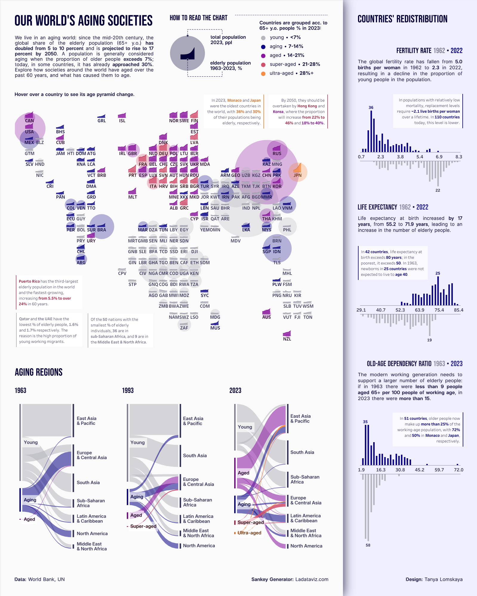 T: I borrowed the two-layer map model from Klaus Schulte's IronViz 2019 entry.
I was hooked by the ability to display the indicator as both a current static value (the area of the underlying circle) and a historical trend (the height of the overlaying bars), and all this with a geographic breakdown.
I decided to apply his approach to visualizing the aging of the world's population, with a slight twist. While the polygons show the dynamics of elderly population share since 1963, the resulting percentage is expressed not by the size but by the colour of the underlying circle, while its size represents the total population in the last year of observation. This allows us to see, for example, not just the significant current share of elderly people in China, but also how much China contributes to the global picture of aging, given its huge population.
I also added annotations to bring the demographic information to life and set context for the whole narrative.
CJ: From a technical aspect, I love that you’re willing to share more complex charts in Tableau. Going beyond your medium blog on graphviz, are there any other charts that you’d like to replicate in the future? How do you go about planning non-standard chart types design?
T: I borrowed the two-layer map model from Klaus Schulte's IronViz 2019 entry.
I was hooked by the ability to display the indicator as both a current static value (the area of the underlying circle) and a historical trend (the height of the overlaying bars), and all this with a geographic breakdown.
I decided to apply his approach to visualizing the aging of the world's population, with a slight twist. While the polygons show the dynamics of elderly population share since 1963, the resulting percentage is expressed not by the size but by the colour of the underlying circle, while its size represents the total population in the last year of observation. This allows us to see, for example, not just the significant current share of elderly people in China, but also how much China contributes to the global picture of aging, given its huge population.
I also added annotations to bring the demographic information to life and set context for the whole narrative.
CJ: From a technical aspect, I love that you’re willing to share more complex charts in Tableau. Going beyond your medium blog on graphviz, are there any other charts that you’d like to replicate in the future? How do you go about planning non-standard chart types design?
 T: I think that the need for a non-standard chart design mostly arises when you want to depict some complex phenomenon as a whole, without breaking it down into separate indicators. So initially, the audience sees just one graph, which, upon closer inspection, breaks down into many details.
Take, for example, the timeline in the form of a curved area bump chart like this one from Robert Janezic. First, you see the timeline as a whole, along with a couple of genres that finished most popular; then you change the lens and see the path of each genre individually. Then you focus on half-decade percentage distributions; finally, you dig into the story behind the annotations. I tried to create something similar, but so far nothing worthy has come out.
Also, I'd really like to find a way to create Dorling cartograms like this one from IIBA-2016, but in Tableau
T: I think that the need for a non-standard chart design mostly arises when you want to depict some complex phenomenon as a whole, without breaking it down into separate indicators. So initially, the audience sees just one graph, which, upon closer inspection, breaks down into many details.
Take, for example, the timeline in the form of a curved area bump chart like this one from Robert Janezic. First, you see the timeline as a whole, along with a couple of genres that finished most popular; then you change the lens and see the path of each genre individually. Then you focus on half-decade percentage distributions; finally, you dig into the story behind the annotations. I tried to create something similar, but so far nothing worthy has come out.
Also, I'd really like to find a way to create Dorling cartograms like this one from IIBA-2016, but in Tableau
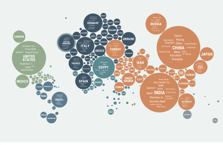 This seems like a really challenging idea, because other than the one mentioned above, I've seen maybe one or two visualizations of this type that actually looked good and not just like unintegrated bubbles. So far, the best attempt in Tableau was by Raisa Hannus; you wrote about it last year.
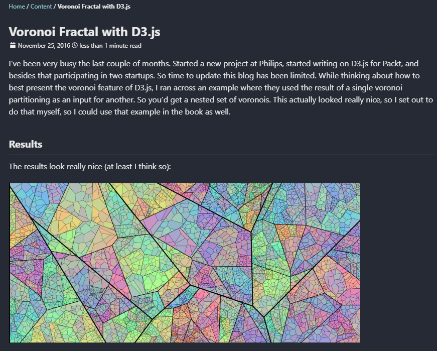
Besides these, I'm fond of recursive Voronoi generative arts, like this fractal made with D3.js. I’ve written Python code to generate this kind of graph for Tableau but have not yet found a topic to use it on.
This seems like a really challenging idea, because other than the one mentioned above, I've seen maybe one or two visualizations of this type that actually looked good and not just like unintegrated bubbles. So far, the best attempt in Tableau was by Raisa Hannus; you wrote about it last year.
Besides these, I'm fond of recursive Voronoi generative arts, like this fractal made with D3.js. I’ve written Python code to generate this kind of graph for Tableau but have not yet found a topic to use it on.
 CJ: Often for tableau visuals now in public, a whole range of tools get used to create them both for inspiration, data prep and design. Do you have a few “go-to’s” you can share that might help others elevate their own visuals?
 T: If you love creative visualizations, then your path in any case lies in the direction of D3.js or Python. For Pythonists, I can advise paying attention to the Shapely library for generating and transforming polygons, SciPy BPoly for generating curves, and PIL for image processing.
> Shapley
> SciPy
> Pillow
If you're not yet a coder, my go-to is to become one.
(Just kidding.)
(Or not.)
I also always recommend studying Inkscape, an open-source Figma-like package, but more oriented towards visual design. The most basic thing you can do with it is to extract the SVG file with labels from Ladataviz.com, change their colour, font, and size, and then upload the resulting image to Tableau as a background for your chart. You can do a variety of more advanced text tricks, generate visual effects for your background and navigation elements, and create the most intricate shapes—there are plenty of tutorials on this topic on YouTube.
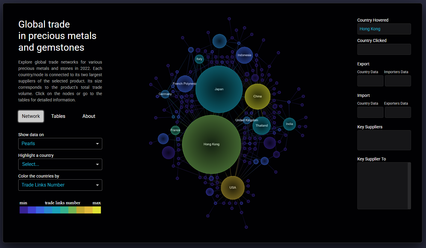
CJ: You’ve done some work on dashboard design using other tools and technology, like your precious metals piece. You reference some places to help you get started with Dribble, Dash, Plotly and stackoverflow. With advances in AI and prompts, what build aspects will become easier?
T: If you love creative visualizations, then your path in any case lies in the direction of D3.js or Python. For Pythonists, I can advise paying attention to the Shapely library for generating and transforming polygons, SciPy BPoly for generating curves, and PIL for image processing.
> Shapley
> SciPy
> Pillow
If you're not yet a coder, my go-to is to become one.
(Just kidding.)
(Or not.)
I also always recommend studying Inkscape, an open-source Figma-like package, but more oriented towards visual design. The most basic thing you can do with it is to extract the SVG file with labels from Ladataviz.com, change their colour, font, and size, and then upload the resulting image to Tableau as a background for your chart. You can do a variety of more advanced text tricks, generate visual effects for your background and navigation elements, and create the most intricate shapes—there are plenty of tutorials on this topic on YouTube.
CJ: You’ve done some work on dashboard design using other tools and technology, like your precious metals piece. You reference some places to help you get started with Dribble, Dash, Plotly and stackoverflow. With advances in AI and prompts, what build aspects will become easier?
 T: This will change the whole process of creating apps. I tried creating an app in Plotly Studio, which is currently in beta testing; the experience reminded me of working with Midjourney. You don't need to know coding at all.
It feels like dashboard/app creation is changing its nature. Instead of developing from scratch, we will improve in interacting with AI, while our technical skills will drift towards revising and correcting AI creations.
CJ: Chord charts are not easy! Your visualization on GoT covers all 8 seasons with colour-coded indicators - what design challenges did you face in representing such an extensive timeline in a single visualization while maintaining clarity about how character interactions evolved over time?
T: This will change the whole process of creating apps. I tried creating an app in Plotly Studio, which is currently in beta testing; the experience reminded me of working with Midjourney. You don't need to know coding at all.
It feels like dashboard/app creation is changing its nature. Instead of developing from scratch, we will improve in interacting with AI, while our technical skills will drift towards revising and correcting AI creations.
CJ: Chord charts are not easy! Your visualization on GoT covers all 8 seasons with colour-coded indicators - what design challenges did you face in representing such an extensive timeline in a single visualization while maintaining clarity about how character interactions evolved over time?
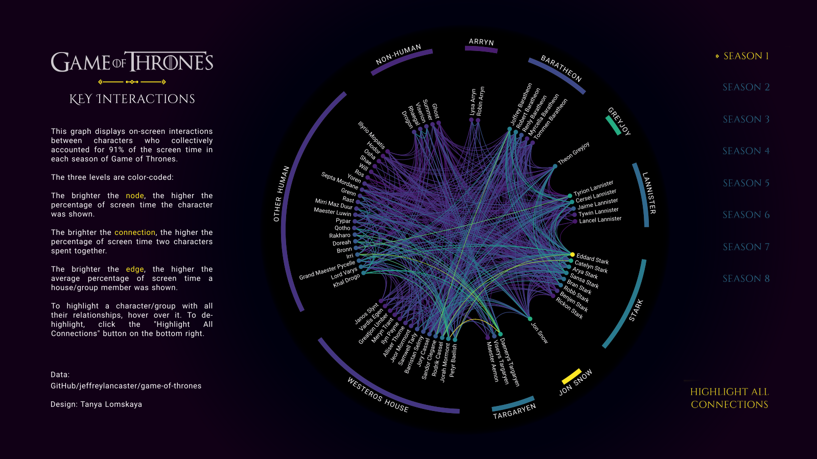 T: 90 percent of the entire creative process in this case happened outside of Tableau. I calculated the coordinates for all three layers of the chord—nodes, links, and edge polygons—using Python. (By the way, I learned to build all these elements in Python thanks to a cool tutorial on radial bar charts from the Flerlage twins: I simply replaced the Excel functions from their step-by-step manual with Python ones and began to calculate the coordinates for all my radial graphs.)
I created all the labels for the chord using Ladataviz.com and Inkscape. Then I turned to Tableau to connect it all, attach the necessary backgrounds to the necessary graphs, and set up navigation between the elements. The final design is simple: in addition to the chord itself, there are toggle buttons for switching between seasons and instructions on how to use the graph.
The main challenge here was the amount of preliminary work: developing the code and generating multiple background images.
CJ: Your circular or chord visuals “Who's In The Spotlight?”, “My Movie Color Wheel” & “What Will We Cook From?” are all the centre focus of the visual. Is this a conscious decision? How do you weigh up what other charts or text to align on the page so as to not detract from the main visual.
T: 90 percent of the entire creative process in this case happened outside of Tableau. I calculated the coordinates for all three layers of the chord—nodes, links, and edge polygons—using Python. (By the way, I learned to build all these elements in Python thanks to a cool tutorial on radial bar charts from the Flerlage twins: I simply replaced the Excel functions from their step-by-step manual with Python ones and began to calculate the coordinates for all my radial graphs.)
I created all the labels for the chord using Ladataviz.com and Inkscape. Then I turned to Tableau to connect it all, attach the necessary backgrounds to the necessary graphs, and set up navigation between the elements. The final design is simple: in addition to the chord itself, there are toggle buttons for switching between seasons and instructions on how to use the graph.
The main challenge here was the amount of preliminary work: developing the code and generating multiple background images.
CJ: Your circular or chord visuals “Who's In The Spotlight?”, “My Movie Color Wheel” & “What Will We Cook From?” are all the centre focus of the visual. Is this a conscious decision? How do you weigh up what other charts or text to align on the page so as to not detract from the main visual.
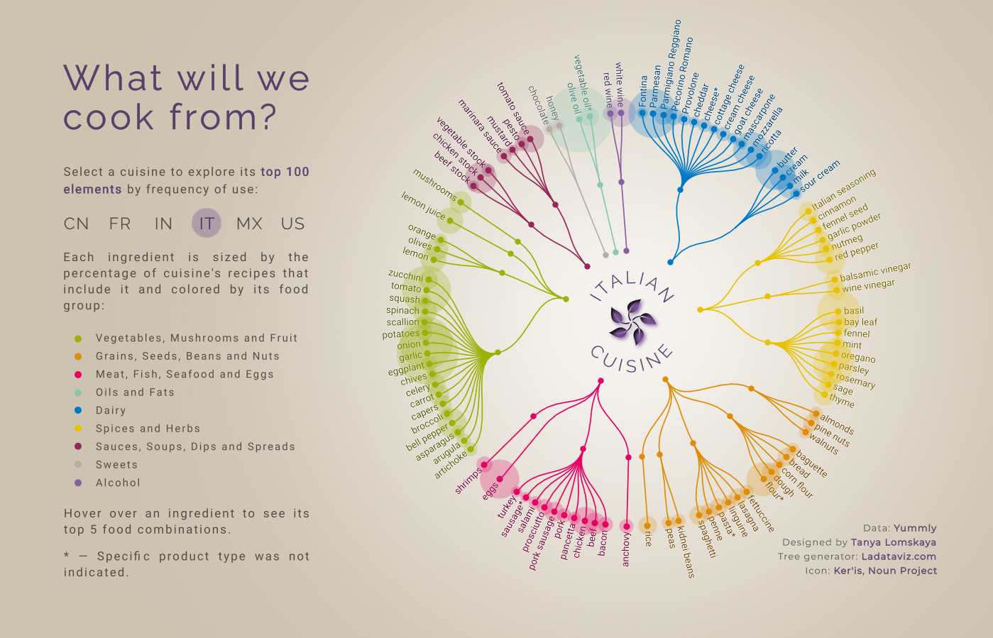 T: Everything that goes beyond the circle is perceived as the periphery—hence this design. Almost all important information is contained within the circle, and everything outside is either legends, navigation elements, or auxiliary charts. This approach seems very common; I have seen many authors utilizing it. Whenever I create a radial, I place it exactly like this.
CJ: What has been your favourite visual to make and why?
T: If you mean which of my visualizations left the most positive emotions while developing, it's "Who Represents a Century." It was a purely creative process from start to finish, more like a game, based on a very interesting dataset. All the way I was focused on the visual part and creating a certain perception that I needed. And the cherry on the cake is how warmly the result was welcomed by the community.
CJ: What guided your decision to use Voronoi diagrams to represent occupational distributions rather than more conventional charts, and how does this visual approach enhance the storytelling about historical representation?
T: Everything that goes beyond the circle is perceived as the periphery—hence this design. Almost all important information is contained within the circle, and everything outside is either legends, navigation elements, or auxiliary charts. This approach seems very common; I have seen many authors utilizing it. Whenever I create a radial, I place it exactly like this.
CJ: What has been your favourite visual to make and why?
T: If you mean which of my visualizations left the most positive emotions while developing, it's "Who Represents a Century." It was a purely creative process from start to finish, more like a game, based on a very interesting dataset. All the way I was focused on the visual part and creating a certain perception that I needed. And the cherry on the cake is how warmly the result was welcomed by the community.
CJ: What guided your decision to use Voronoi diagrams to represent occupational distributions rather than more conventional charts, and how does this visual approach enhance the storytelling about historical representation?
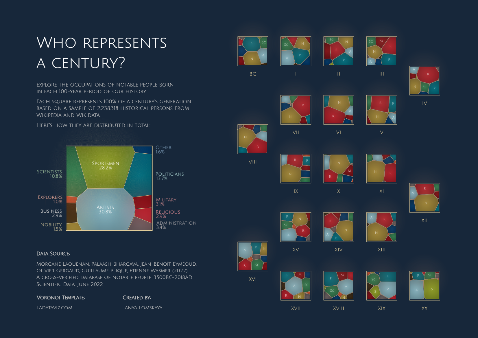 T: It was done more on a whim, but here's how I explain the idea. Sciences Po cleaned up and systematized Wikipedia data on people of different professions who lived in different eras, up to the present day. But Wikipedia is not an objective source of knowledge about the inhabitants of a particular time. It contains information only about those people who, for some reason, remained in the memory of mankind.
In other words, this data is about our perception or fantasy about the past, not about the objective truth. Thus, the idea was to simultaneously show you each century's proportions and somehow make you doubt them.
Voronoi came in perfect for this. Apart from the stated effect, this graph resembles a mosaic or stained glass, which is strongly associated with history, or abstract art, which completely appeals to our subjective perception. To enhance this impression, I gave the graphs the appearance of an art gallery.
CJ: In the wider data visualisation community, are there any portfolios of work that have really inspired your journey, or made you think “wow I’d like to make something like that!”?
T: There are actually a lot of people about whose work or entire portfolios I think, “Wow.” Let me list only those who have significantly influenced the creation of the visualizations already published in my portfolio. These are the Flerlage twins, Andy Kriebel, Chimdi Nwosu, Priya Padham, Pradeep Kumar G, Kevin Wee, Dennis Kao, Wendy Shijia, Klaus Schulte, Will Sutton, and Damola Ladipo.
CJ: Are you working on any exciting personal projects?
T: I have been wanting to start making maps for a long time now, as I am incredibly inspired by the work of Dennis Kao, Nir Smilga, Naresh Suglani, and George Koursaros. Next, I want to continue the theme of representation of people in history, but this time focusing exclusively on women. I am curious what the data will show. And at some point in the future, I would like to do a project dedicated to my home country, Belarus.
Have a great week ahead!
LOGGING OFF,
CJ
T: It was done more on a whim, but here's how I explain the idea. Sciences Po cleaned up and systematized Wikipedia data on people of different professions who lived in different eras, up to the present day. But Wikipedia is not an objective source of knowledge about the inhabitants of a particular time. It contains information only about those people who, for some reason, remained in the memory of mankind.
In other words, this data is about our perception or fantasy about the past, not about the objective truth. Thus, the idea was to simultaneously show you each century's proportions and somehow make you doubt them.
Voronoi came in perfect for this. Apart from the stated effect, this graph resembles a mosaic or stained glass, which is strongly associated with history, or abstract art, which completely appeals to our subjective perception. To enhance this impression, I gave the graphs the appearance of an art gallery.
CJ: In the wider data visualisation community, are there any portfolios of work that have really inspired your journey, or made you think “wow I’d like to make something like that!”?
T: There are actually a lot of people about whose work or entire portfolios I think, “Wow.” Let me list only those who have significantly influenced the creation of the visualizations already published in my portfolio. These are the Flerlage twins, Andy Kriebel, Chimdi Nwosu, Priya Padham, Pradeep Kumar G, Kevin Wee, Dennis Kao, Wendy Shijia, Klaus Schulte, Will Sutton, and Damola Ladipo.
CJ: Are you working on any exciting personal projects?
T: I have been wanting to start making maps for a long time now, as I am incredibly inspired by the work of Dennis Kao, Nir Smilga, Naresh Suglani, and George Koursaros. Next, I want to continue the theme of representation of people in history, but this time focusing exclusively on women. I am curious what the data will show. And at some point in the future, I would like to do a project dedicated to my home country, Belarus.
Have a great week ahead!
LOGGING OFF,
CJ